
“I'm more intrigued and inspired by pictures, photos and visual displays. This is why Pinterest and Instagram are so fun to browse and shop. It's like peering through a magazine that takes you directly to the items that you're interested in learning more about.
— Amazon Customer
Summary
Role
Product Designer, end-to-end UX, content strategy, engagement systems
Timeline
2016–2018
Team
Amazon Shopping, social commerce team
Platforms
Amazon iOS and Android apps
Outcome
Launched to millions of customers. Product later evolved into Amazon Inspire (subsequently sunset). The design thesis of social discovery through shared interests carried directly into my work at IMDb.
Amazon Spark
Overview
Amazon Spark was an experiment in a question Amazon hadn't cracked: what happens at the top of the funnel, before a customer knows what they want?
Amazon had perfected the end of the shopping journey (inventory, reviews, purchasing, shipping), but for customers getting into a new hobby, exploring trends, or simply browsing without intent, the experience was a search box and an algorithm. Meanwhile, customers were discovering products on Instagram and Pinterest, then coming to Amazon only to buy. We wanted to close that gap: create a place within Amazon for discovery that felt social, visual, and personal.
The Defining Moment
Our VP at the time, Chee Chew, had come from Google with a vision to make Amazon bigger than Google. As we developed Spark, he gave us a clear directive: inspire envy. His thesis was that if customers saw what other people owned (their setups, their purchases, their lifestyle), it would drive engagement and purchases. Envy as a growth lever.
I pushed back.
What's more powerful than envy is connection. Not "I want what they have" but "me too!" It's connecting with others who share my passions, my hobbies, my style, my culture, my interests. Envy is extractive. It makes customers feel inadequate and drives anxious purchasing. Connection is generative. It makes customers feel seen and drives exploration, loyalty, and trust.
This wasn't just a philosophical disagreement. It was a design direction that shaped every subsequent feature I built:
Onboarding through interests: not "see what celebrities own" but "what are you into?"
Profiles showing recently followed interests: identity as taste, not status
Mutual interests between customers: "you both love mid-century modern" as the basis for trust
Enthusiast badges earned per interest: credibility through demonstrated knowledge, not follower count
Hearts: saving things you love, not envying things others have
The distinction seems subtle, but it produces fundamentally different systems. An envy-driven feed optimizes for aspiration gap (you feel lacking → you buy to close the gap). A connection-driven feed optimizes for resonance (you feel understood → you explore further → you trust recommendations from people like you).
I chose connection. That decision is the seed of everything I've built since.
The problem
Even with the connection thesis as our north star, execution was hard. Early prototypes revealed that the product's real challenge wasn't UI. It was content and trust.
"I go to Amazon to find great deals on products. It's hard to wrap my mind around why Amazon would do this feed unless it was related to a product I was purchasing."
— Amazon Customer
Content quality was low. Early posts were topical but not useful, not shoppable, not interesting, not trustworthy.
2. Trust between strangers was absent. Unlike Instagram (where you follow people you know), Spark was a marketplace of strangers. Why should anyone care what they recommend?
3. The connection between discovery and purchase was weak. You could see a nice photo, but the path from inspiration to Amazon's catalog wasn't intuitive.
A beautiful feed with bad content is just a pretty empty room. The real design work was in systems that made the content worth showing up for, systems grounded in connection, not envy.
Amazon app, 2016
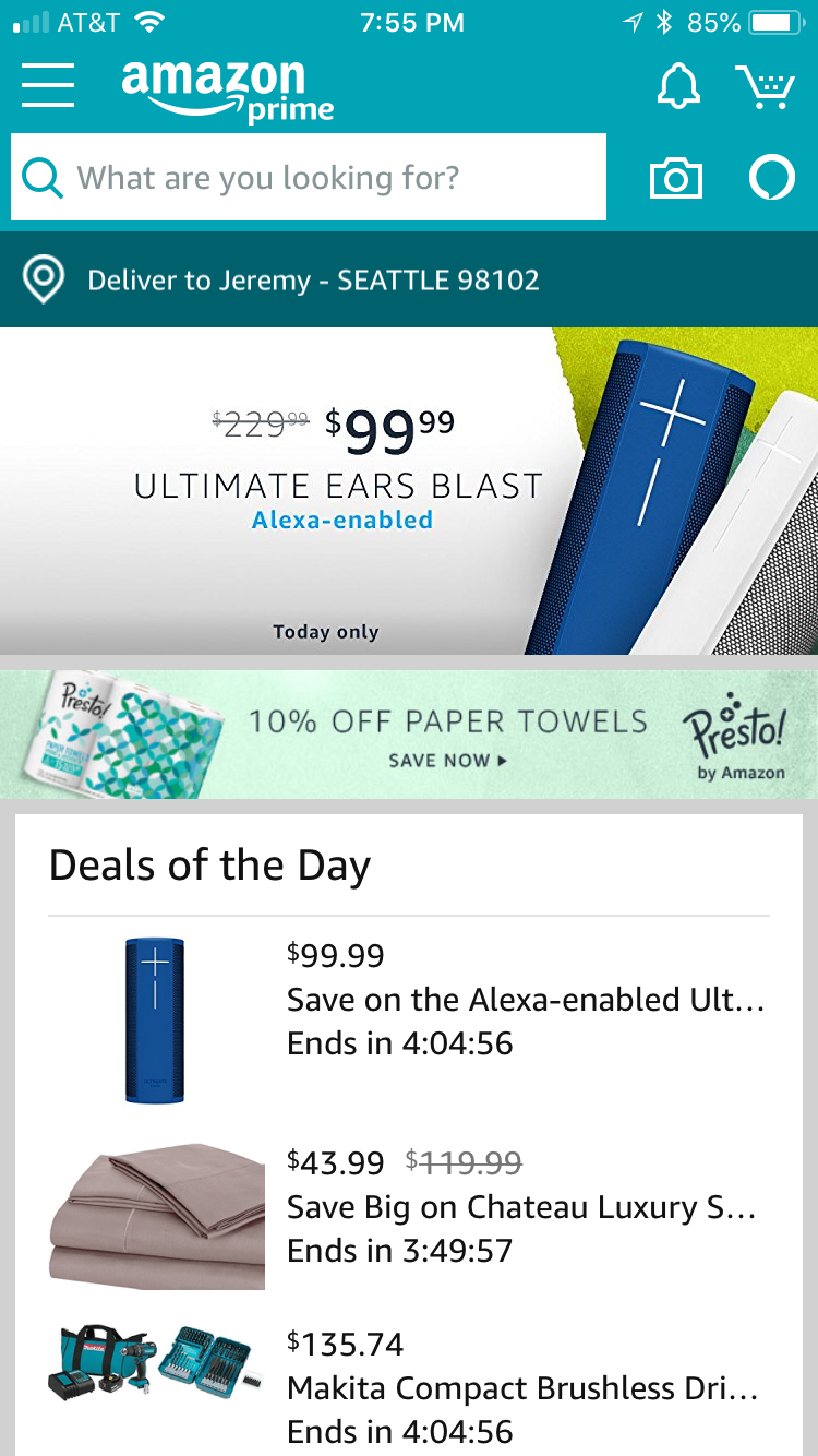
The Amazon app home screen in 2016, optimized for search, not exploration.
Establishing the Visual Foundation
Before tackling the content problem, I needed the feed to feel credible. I audited the initial prototype, identified visual noise and inconsistency, and established a pattern library with clear content anatomy.
Initial prototype, July 2016
UI audit
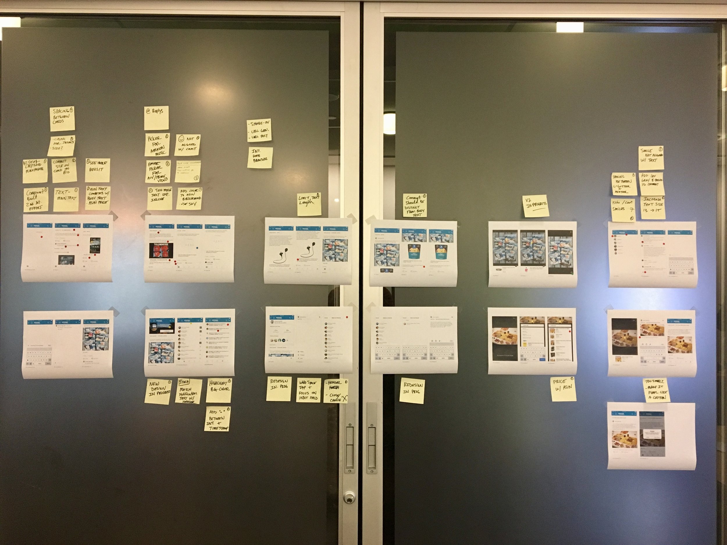
Captured the entire experience and identified opportunities to simplify.
Pattern library and content anatomy

Text styles, color palette, and anatomy of a post.
Before and after


Updated prototype, November 2016
Solving the Content Problem
With the UI simplified, I focused on three design strategies to make the feed worth visiting.
Strategy 1: Encourage quality content through identity
If you want better content, give creators a reason to care about their reputation. I redesigned profiles to make contribution history visible and introduced a badging system that rewarded quality.
Profile enhancements. Contribution history and recently followed interests.
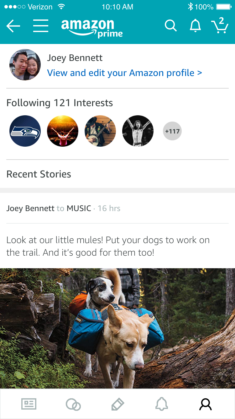

Badging and achievements. Notifications when content performed well, visible badges on posts that met quality thresholds.


Enthusiast program. Elevated contributors who consistently created quality, shoppable content. Their badge signaled trustworthiness to browsers.


Strategy 2: Make discovery shoppable
The bridge between "I like this photo" and "I can buy this thing" needed to be frictionless. I designed a "heart" system that saved products directly to your profile, and shoppable photo tagging that connected visual content to Amazon's catalog.
Saving products


Shoppable photos


Results. First 72 hours:
330 customers hearted 1,083 products (108 limited-access)
Average: 3 products hearted per customer
A top fashion contributor received 113 hearts
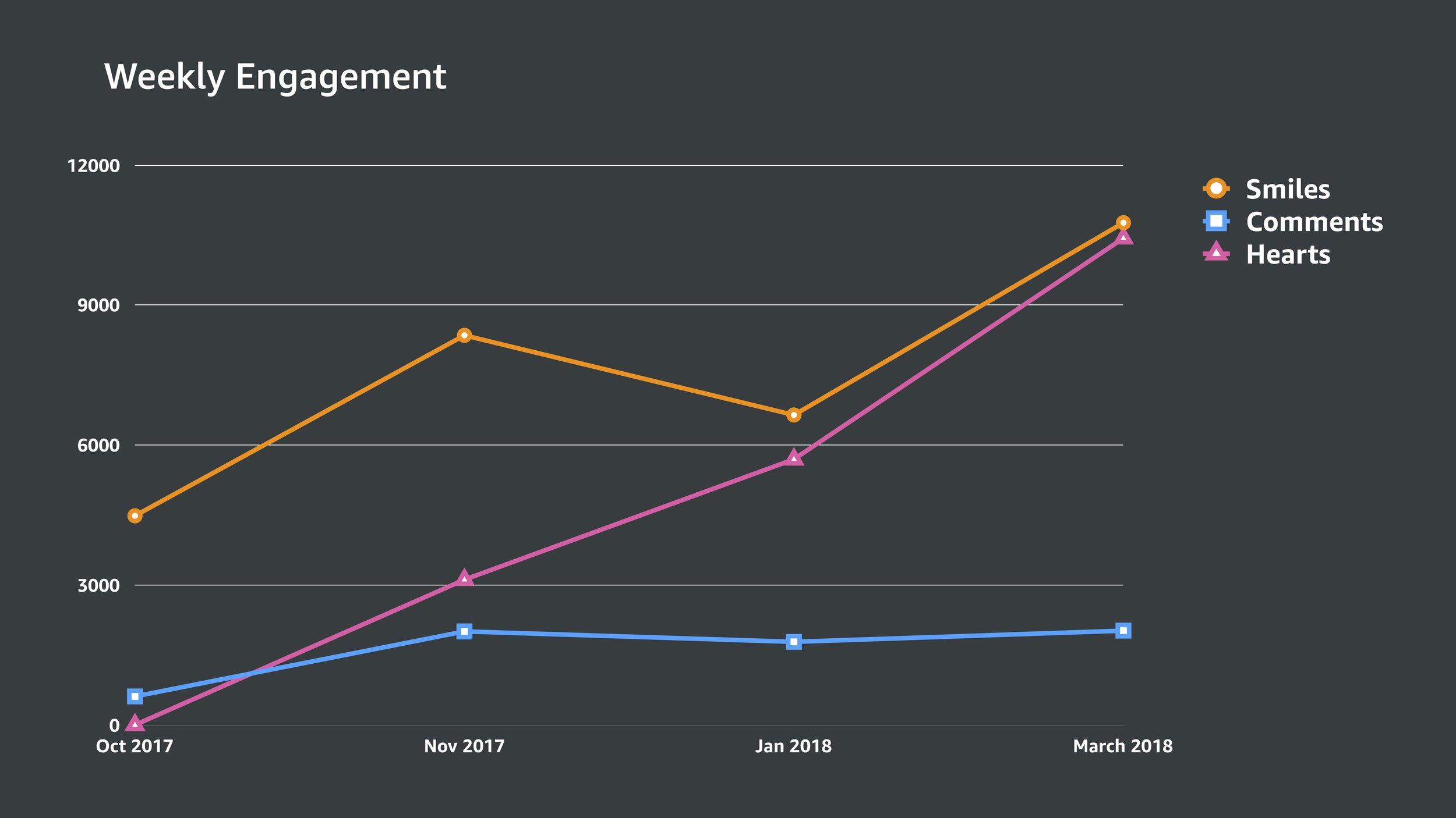
Results. First 6 weeks:
Heart became the second most popular action by unique contributors
16K+ products hearted, driving 15K+ notifications
Weekly contributor percentage doubled: 16% → 33%
Customers who hearted a product had significantly higher 7-day revisit rates (Full Access: 31% vs. 16%; Limited Access: 22% vs. 13%)
Strategy 3: Build trust through safety
In a marketplace of strangers, trust requires two things: the ability to signal credibility (the enthusiast program) and the ability to remove bad actors. I designed the reporting and moderation systems that let customers flag content and hide posts, with clear categorization that helped the moderation team take appropriate action.
Reporting abuse


Moderation


The Onboarding Question
We tested two approaches to the cold-start problem, and the results surprised us.
Traditional onboarding: gate the feed behind setup
Customers selected interests and created a profile before seeing any content. Higher personalization from the start, but higher friction to first value.


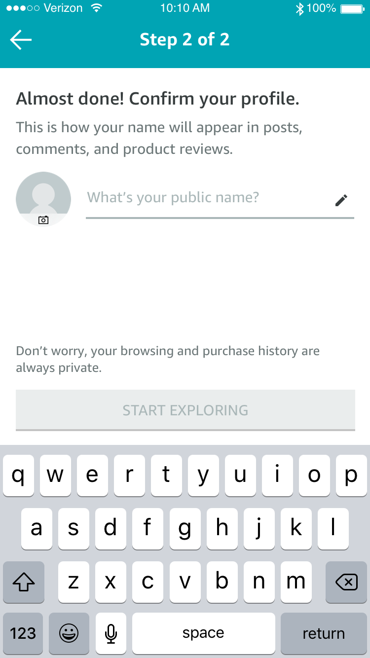

Light onboarding: show the feed first, personalize later
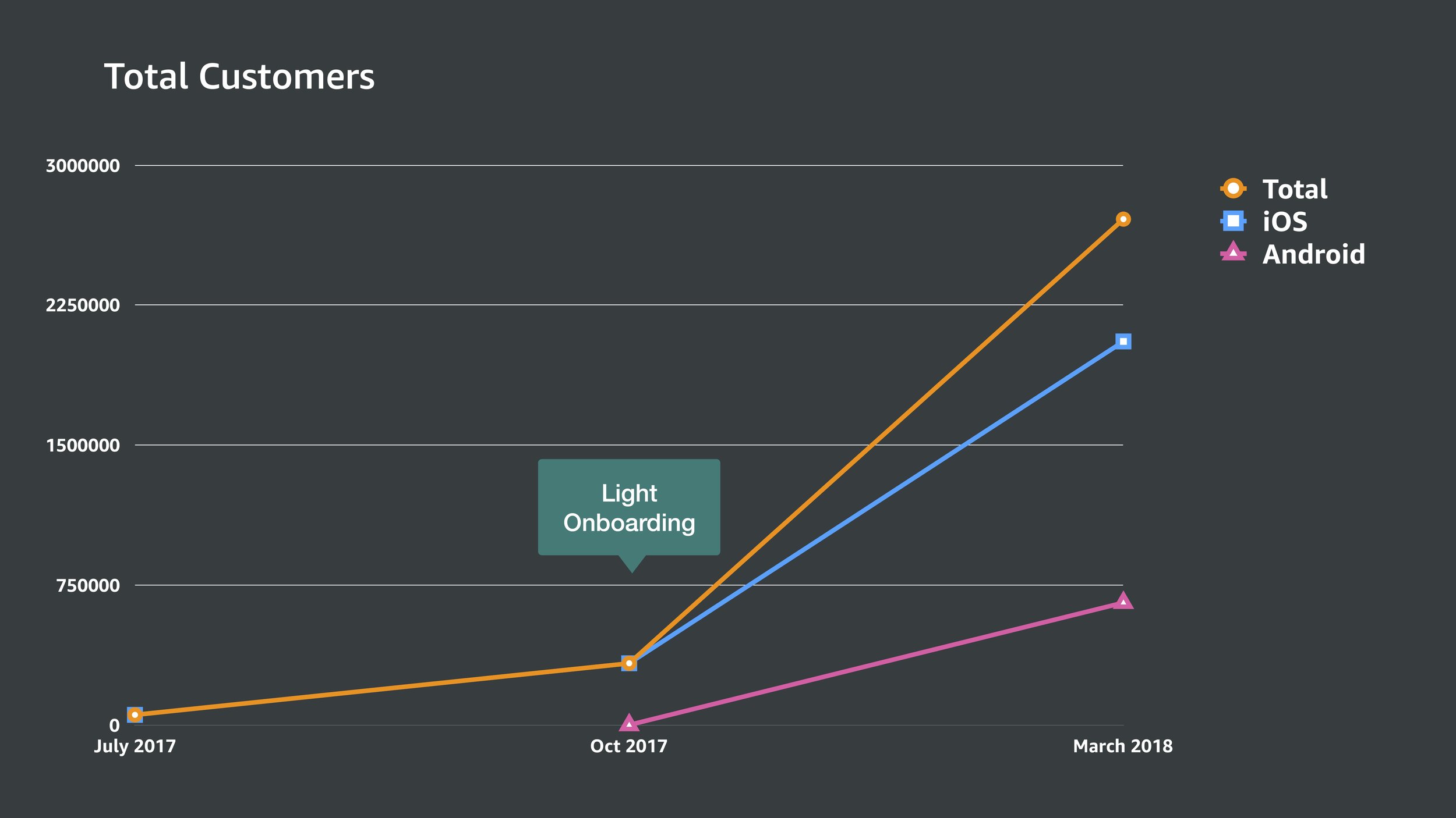
Customers saw a generic feed of popular content immediately. Interest selection and profile creation were deferred to the moment of first interaction (commenting, saving, etc.).

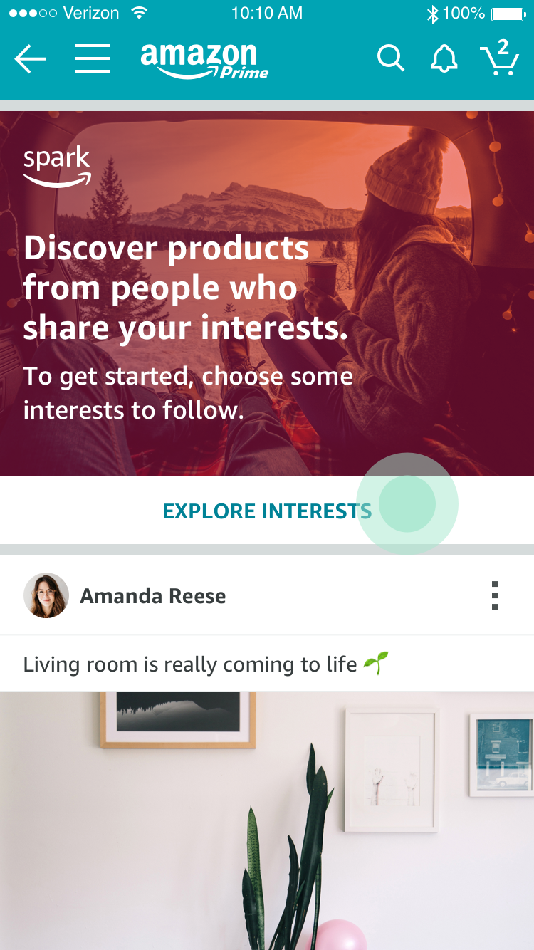

Profile creation


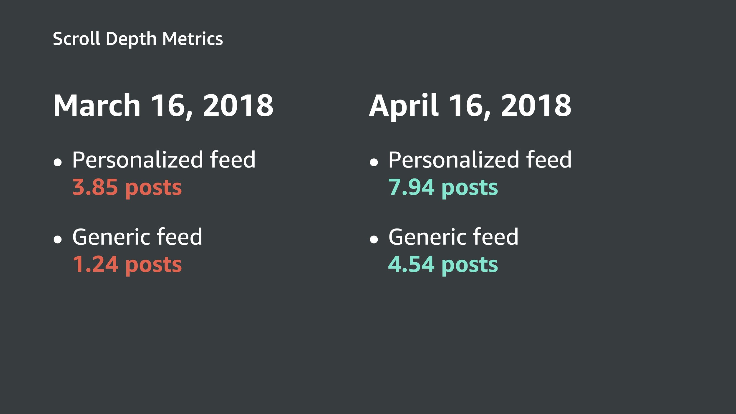
Results

Scaling and Iteration
International expansion
When Spark expanded to India, products tagged in US posts weren't available. I designed the fallback: when a tagged item was unavailable in the customer's marketplace, we surfaced similar items from their local catalog, keeping the discovery-to-action path intact.


Optimizing the feed for browsing
Post layout was consuming too much vertical space. I restructured post anatomy to prioritize the image and product tags, reducing scroll effort and increasing content density.


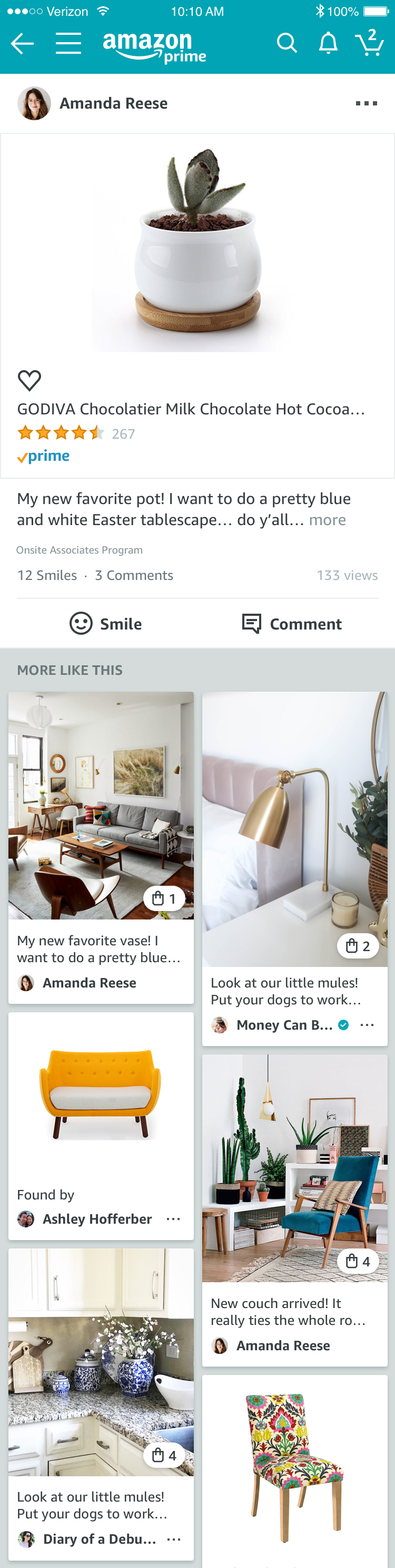
Contextual navigation, snackable feeds, and endless discovery
As the feed matured, I experimented with contextual navigation, adapting the nav bar based on the customer's scrolling state and surfacing promotional ingresses for new features. I also explored a Pinterest model of snackable, image-forward feeds for endless discovery.

What I Carried Forward
Amazon Spark didn't survive as a product. It became Amazon Inspire, which was eventually sunset. That's an honest outcome. Not every bet wins at the business level.
But the design thesis was right. Connection over envy. Shared interests as the foundation for trust. Identity as taste, not status. The things I argued for at Spark are the same things I'm building at IMDb today, with better positioning, deeper data, and a customer base that comes to discover, not just to buy.
The through-line: discovery through shared interests, personalization through explicit signals, community through earned trust. The domain changed from products to entertainment. The customer need didn't change at all, and neither did the conviction that connection is more powerful than envy. That's still the bet I'm making, ten years later.
Reflection
Spark taught me three things I still carry.
First: a feed is only as good as the trust it earns. You can design the most beautiful scroll experience in the world. If customers don't trust the content or the people behind it, they won't come back. The same lesson applies to IMDb's community features: we're not competing with Reddit on features, we're competing on why would I trust this person's recommendation? The answer is the same in both products: shared interests, visible credibility, and transparent systems.
Second: positioning determines product fate. Spark had great features inside it, but a social discovery experience embedded inside a transactional shopping app faces a fundamental positioning problem. Customers came to Amazon to buy, not to browse. At IMDb, the positioning is flipped: customers come to discover. The same design thesis works better when it matches the customer's existing intent.
Third: stand for something. The envy-vs-connection disagreement with leadership wasn't comfortable, but it produced better design because it gave the work a clear value system to design against. Every feature choice became easier once we knew we were optimizing for resonance, not aspiration gap. Having a thesis, and being willing to defend it, is what separates design leadership from design execution.