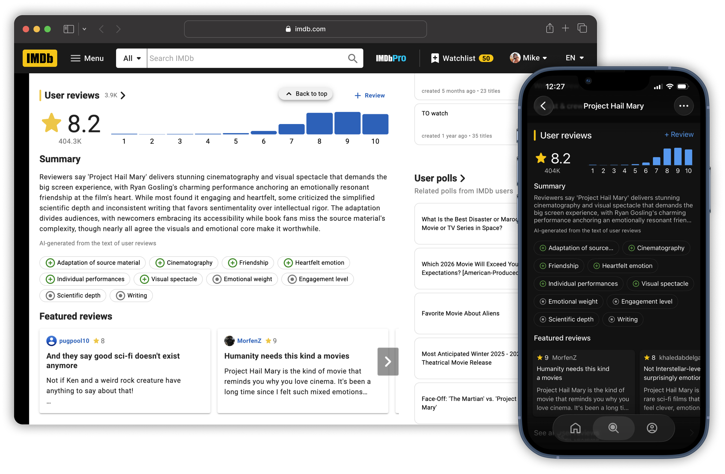
IMDb Review Summaries
“It makes it easy to quickly glance and understand the opinions of the content by the majority, but also it's easy to delve deeper or look at opinions on specific aspects if desired. There is a lot of capabilities in this one section.”
— IMDb Customer,
Post-Launch Research
Summary
Role
UX lead: widget redesign, theme system, LLM quality oversight, reg-gating
Timeline
2025 (redesign, launch) → 2026 (scale, reg-gating)
Team
Alex Lazaris (PM), Sarah Emerson (PM), Amazon AGI, engineering, research
Platforms
iOS, Android, web
+46%
37K
month-over-month theme engagement
titles with summaries
+287%
+10.2%
reviews page views (web)
reviews page views (apps)
+0.66%
80%
reviews written
"very satisfied" in post-launch research
The Problem
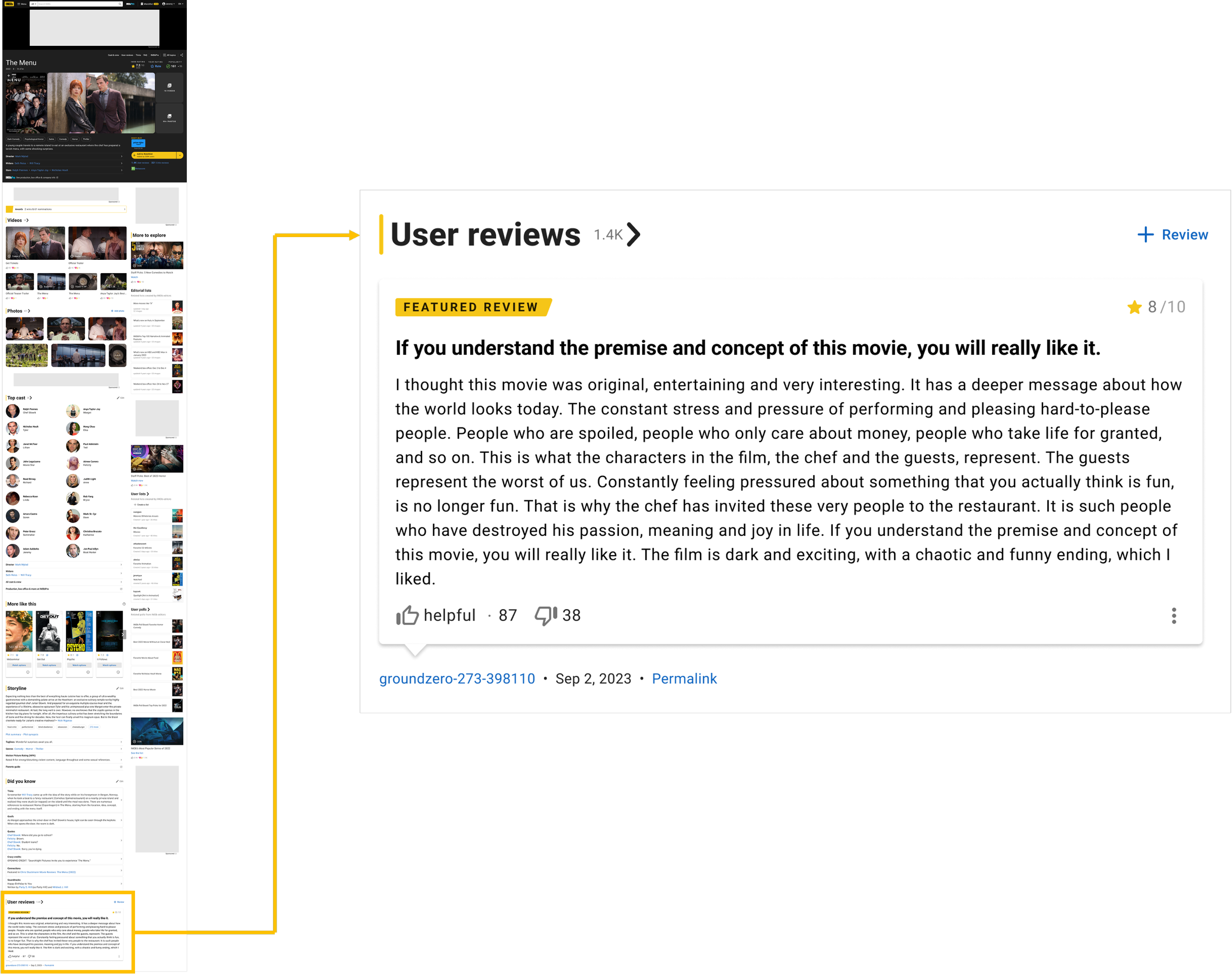
Every IMDb title has an average rating. What it doesn't have is a fast way to know why fans gave it that rating. The rating is the verdict; the reviews are the reason. But there are thousands of reviews per title, and many of them are substantial. The old widget sat far down the page and showed a single review, so the "why" was too buried to be found.
The Insight
Fans use reviews at two key moments:
Before watching: Is this worth my time? Is it appropriate for who I'm with?
After watching: Did other people see what I saw? What am I missing?
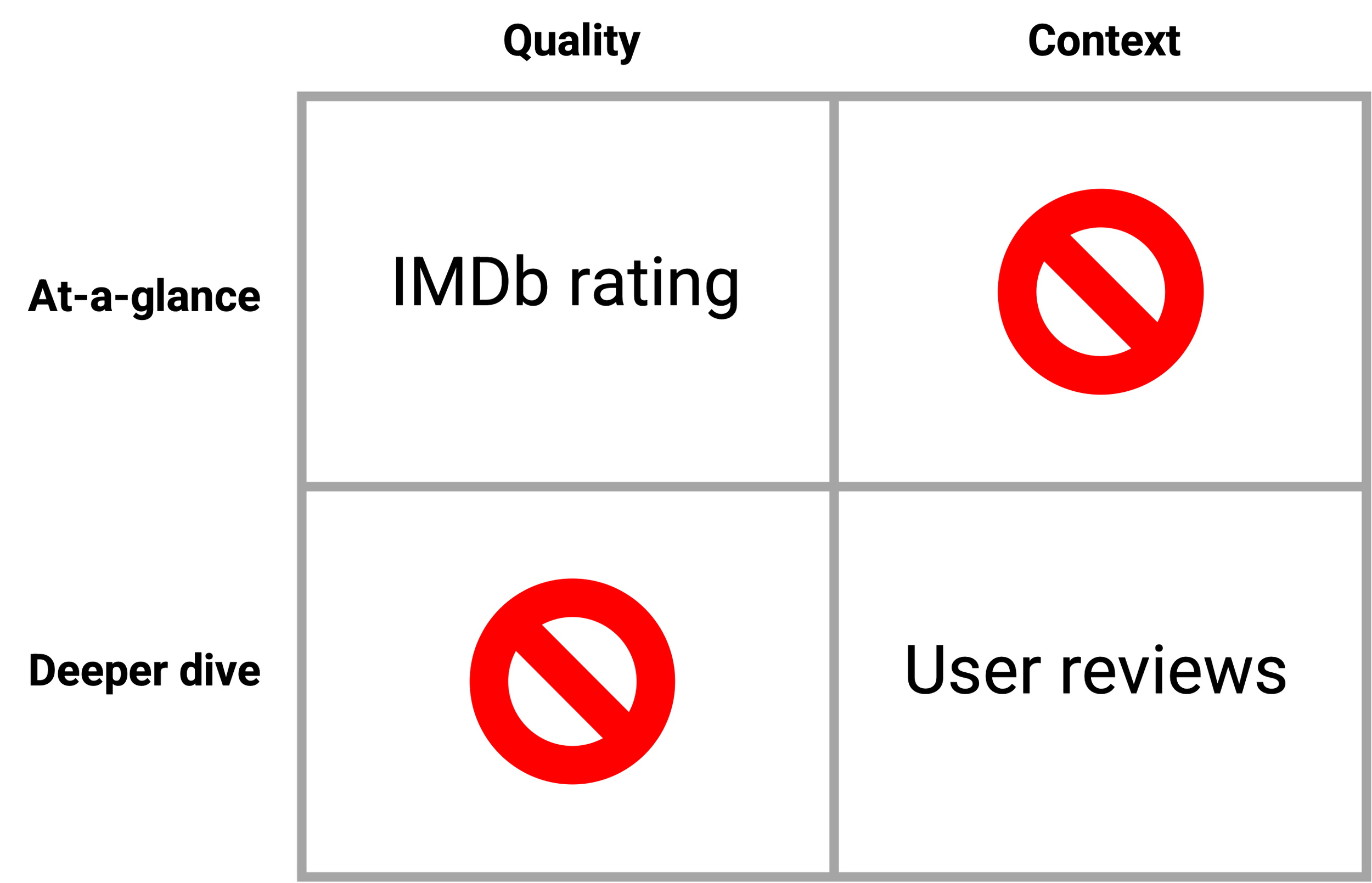
At both moments, customers evaluate titles along two dimensions:
Quality: Do fans generally like this? are opinions strong or split?
Context: Does this fit my mood, my situation, my preferences?
And they need two levels of depth:
At-a-glance: a fast read that answers "should I care?"
Deeper dive: the ability to explore why.
IMDb was missing at-a-glance context and a deeper dive into quality.
The Design Thesis
A successful implementation of generative AI is measured by its ability to preserve and amplify the value of individual human voices
IMDb's competitive advantage in an AI-dominated world is human voices. A GenAI summary that flattened reviews into a single machine-generated paragraph would be a betrayal of the platform. A GenAI summary that made human reviews easier to find and act on would deepen the moat.
The hypothesis: GenAI review summaries will deepen, not replace, engagement.
Making Room
Before I could add GenAI content to the Reviews Widget, I needed the widget to be somewhere customers would actually see. In early 2025 I designed a two-treatment experiment across iOS and web to test moving the widget higher on the title page and improving the featured-review presentation, showcasing 5 featured reviews instead of just one. The experiment did not include the GenAI summary yet. It was infrastructure work, clearing the space where the summary would eventually live.
iOS results (5-week weblab, Mar to Apr 2025): Reviews page views +10.21%
Web results (5-week weblab, Mar to Apr 2025): Reviews page views +287.3%
The durable learning: The Cast Widget is the "scroll ceiling" on IMDb title pages. Once customers reach it, most stop scrolling. Anything placed below the Cast Widget will have significantly lower visibility, which has direct implications for both product feature placement and display ad viewability.
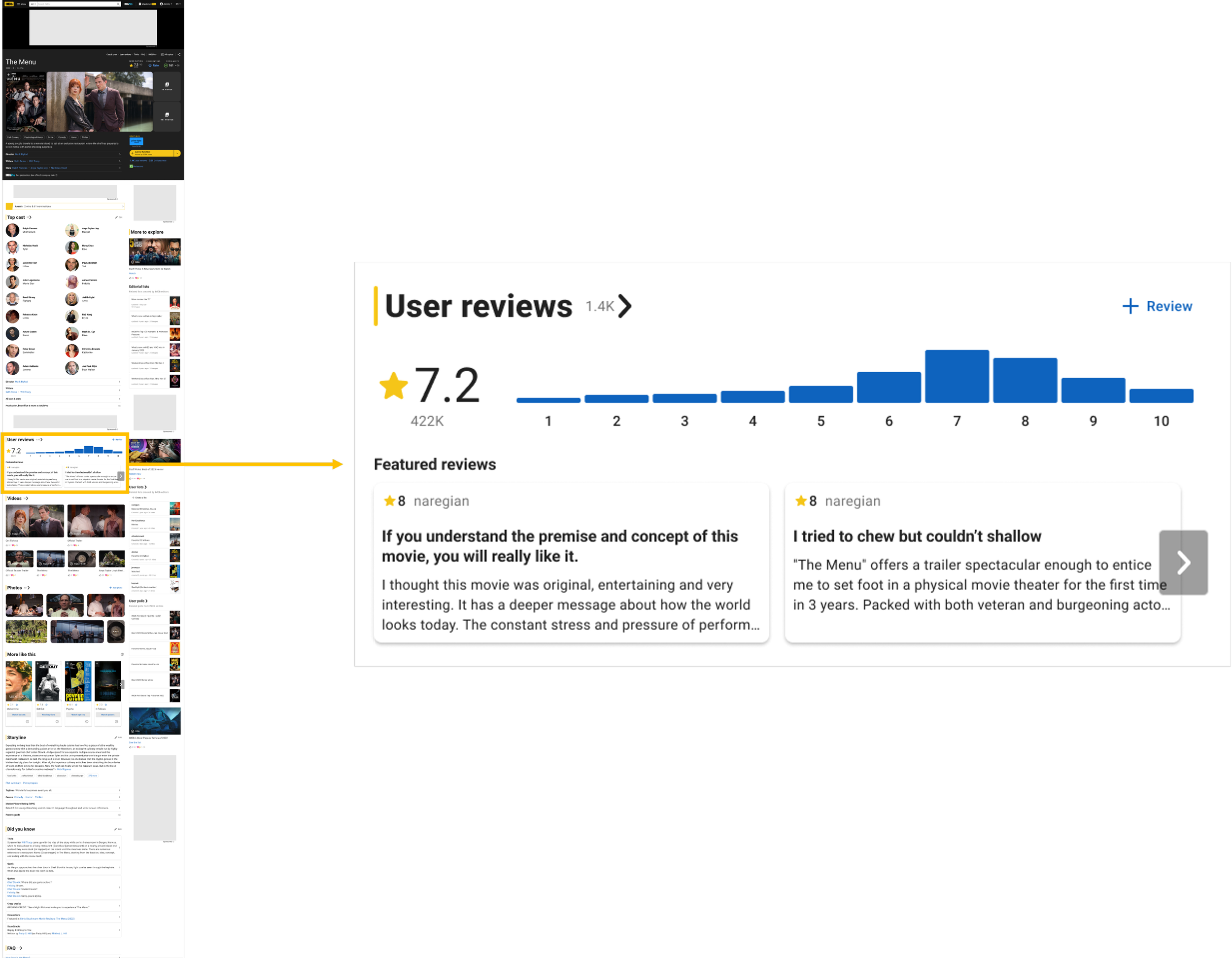
The Redesigned Reviews Widget
With the widget relocated, I redesigned it to solve the two-dimensional evaluation problem (quality + context, at-a-glance + deep-dive). Four layers, one per quadrant, each a deeper investment for a deeper return:
Ratings histogram (at-a-glance quality). Shape tells the story instantly: consensus or division. Each bar filters the reviews.
Review summary (at-a-glance context). A short GenAI paragraph capturing the "why" behind the score in one read. The pre-watch tool, a fast yes/no. Scaffolding, not a replacement.
Themes (deep-dive context). Up to 10 tagged positive, mixed, or negative, each opening a deeper summary. The post-watch tool: dig into pacing, acting, the ending.
Featured reviews (deep-dive quality). Five human voices reflecting the rating spread. The summary helps you decide whether to read; these are the reviews themselves.
Same widget, two moments: the summary is the decision tool, the themes the reflection tool.
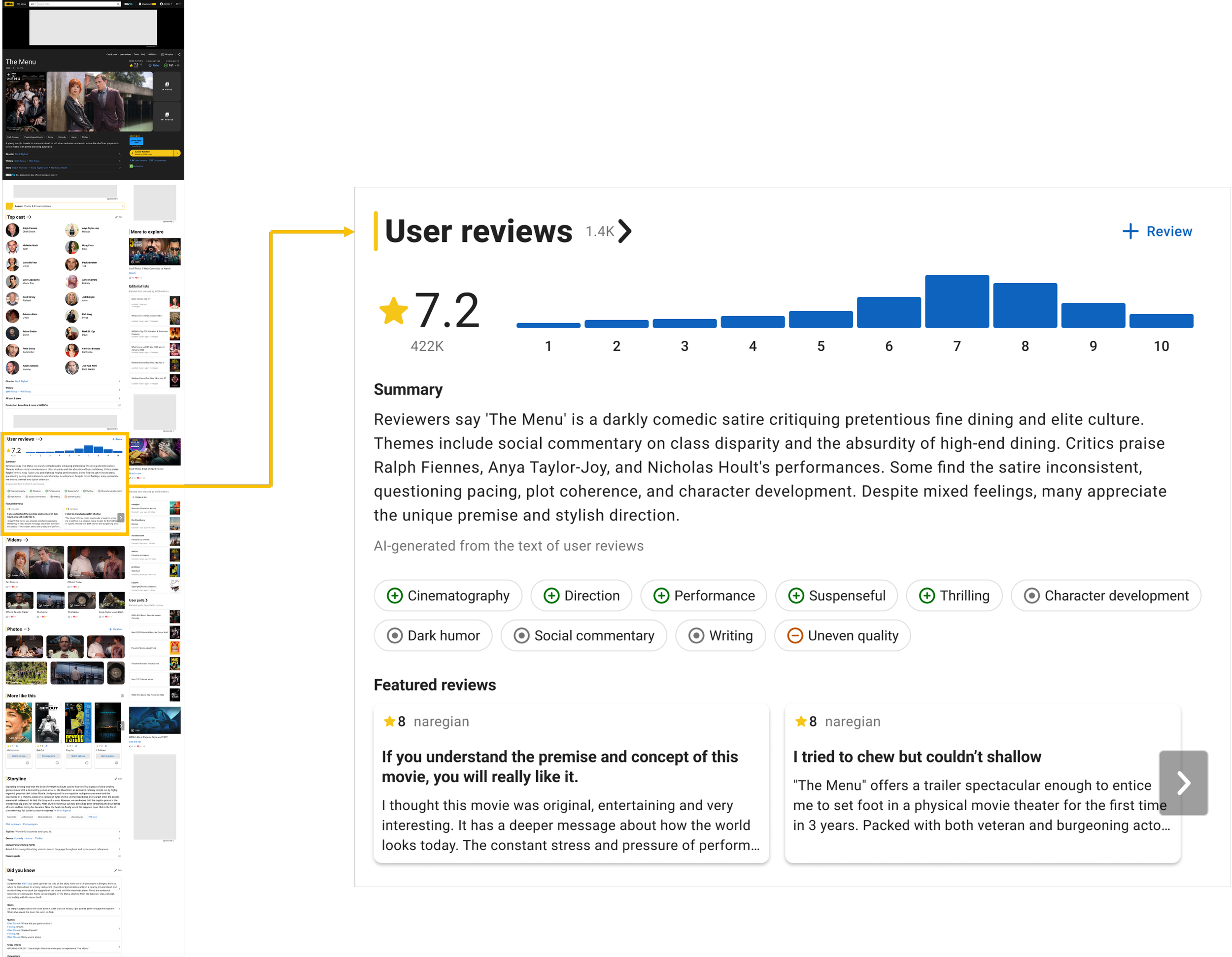
The redesigned reviews widget
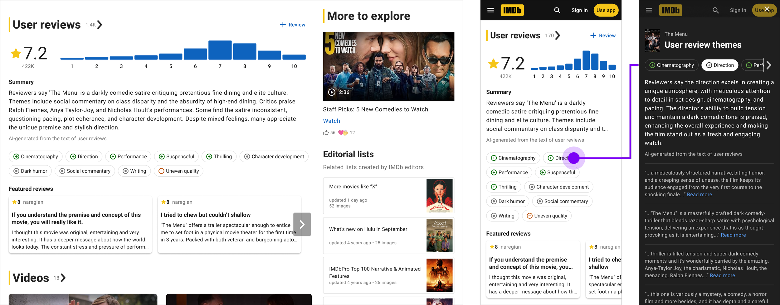
Desktop, mobile, and theme summary
Building with LLMs
We partnered with Amazon's Artificial General Intelligence (AGI) team to develop the pipeline. For each title, the LLM ingested 250 of the most helpful user reviews and produced three outputs:
A short user review summary
10 review themes with sentiments (drawn from a defined vocabulary)
10 theme summaries (deeper text for each theme)
To constrain the LLM's output space, I defined a taxonomy of 165 possible themes across 10 focus areas (acting, cinematography, story, ending, characters, and so on). We refined it by removing themes that were too similar (like "character depth" and "character development"), themes that were inherently one-sentiment ("trauma" always reads negative), and themes too abstract to be actionable. Each theme received a definition to give the LLM shared context for accurate attribution.
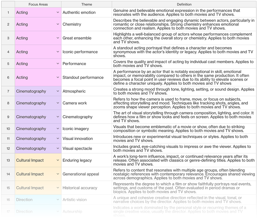
The prompt itself carried IMDb-specific guardrails: no spoilers, follow IMDb content guidelines, hold to a target length, keep the tone neutral rather than editorial. For each title, the model ingested the 250 most helpful reviews and produced three coupled outputs under IMDb guardrails: no spoilers, neutral tone, target length.
Our first pipeline generated those outputs with separate prompts, and it showed: themes named in the summary didn't appear in the theme list, and observations repeated across outputs. The lesson was clear: related outputs need a shared state. We rebuilt the pipeline to generate the themes first (evidence-based), followed by the summaries. At every step of the way, a secondary LLM acted as a judge. That's what let us scale from 1,600 hand-checked titles to 25K safely. No GenAI feature ships broadly without automated QA.
Launch
The MVP launched in June 2025 to 1,565 titles worldwide, expanding to 1,600 titles by September. The pipeline was rebuilt in Phase 2 (April 2026) with automated quality validation, extending coverage to 25,000 titles.
Engagement metrics (from launch to Q3 2025):
Engagement with themes: +46% month-over-month, outpacing page visits to titles with summaries (+24% m/m)
Customer-contributed reviews: +0.66% versus control (validating the thesis that GenAI would deepen, not replace, human contribution)
Coverage: 1,565 → 1,600 → 25,000 titles
What Research Revealed
A study of 45 review-readers validated the bet, and, just as important, the absence of alarm: 80% very satisfied, 91% recognized the content as AI-generated (transparency held without any label), and 60% felt neutral about AI being involved: "I do not feel any differently." For this feature, neutrality is the win. Enthusiasm would have meant the AI was calling attention to itself; indifference meant it was quietly useful.
It wasn't flawless. The "mixed" sentiment icon (a bullseye) read as "neutral" rather than "hotly debated," a concern I held and research confirmed. And theme labels ("Pacing," "Editing") were more clinical than how fans actually talk. Both are queued fixes, not excuses.
Lessons Learned
Working closely with an LLM through launch surfaced four principles I now apply to every GenAI design conversation at IMDb:
1. Be discerning. Not all content benefits from a summary. We removed summaries from title types where a summary is unexpected or unhelpful, including standup comedy, news, and documentaries. A summary of a stand-up special is either a plot summary (breaks the format) or a critique of the comedian (breaks the community norm). Sometimes the right answer is not to summarize.
2. Context is king. LLMs need domain context to produce useful output. At IMDb, that means defining terms the model might otherwise get wrong: what "adaptation" means in a franchise context, what qualifies as a "spoiler," what "helpful" means in a review. When in doubt, provide definitions for everything.
3. Disjointed prompts create disjointed experiences. Our MLP generated the summary, themes, and theme summaries with separate prompts. This produced three consistent bugs: themes mentioned in the summary sometimes didn't appear in the theme list; observations repeated across outputs; and we couldn't extract the original review text to display alongside each theme summary. The learning: for coupled outputs, use a single prompt or a coordinated pipeline that shares state.
4. Automate QA before you scale. For the first 1,600 titles, a small team of us manually reviewed every summary for spelling, grammar, facts, bias, spoilers, and prompt compliance. It didn't scale, but it taught us exactly what an automated quality pipeline needed to check. No GenAI feature is shippable to a broad customer base without an automated way to validate the output against the same criteria a human would.
We rebuilt the Phase 2 pipeline around these lessons: themes first (extractive, evidence-based), then summaries derived from themes, with LLM-as-judge quality validation at every step.
Reflection
The decisions that mattered most on this project were invisible: which titles get a summary, which themes are allowed, what definitions the model holds, how the outputs are structured. For GenAI, that is the design surface. Prompts are UX. Taxonomies are UX. Quality validation is UX. The widget was the easy part. The judgment was in shaping the model's constraints, and that's where a designer has to be in the room.
Where it's going: Review Summaries is the first and best-known output of Marvin, IMDb's GenAI content-understanding platform. Each summary now distills user reviews into a title-level narrative plus per-aspect summaries, sentiment scores, and citations back to source reviews, built by a multi-step pipeline (mine aspect/sentiment/keyphrase triples → aggregate → rank by aspect → summarize per aspect → summarize to a title-level narrative) that validates at every step. Marvin is expanding to parental-guide summaries, title overviews, name overviews, and awards overviews, and is evolving from a single feature into a workflow factory — a common building block other IMDb teams can use to prototype and power their own generative workflows.