

“Sitting in front of the TV, it’s always like, ‘what do you want to watch’ - you know? And you’re looking at all of these channels - you’ve got Netflix and Amazon Prime and Disney +. And you’ve got cable. We’ve got it all. And we don’t know what to choose. It’s very frustrating.”
Overview
Role: Lead UX Designer (sole designer for 14 months, then co-lead with Kaitlin Powell)
Timeline: 2021–2024 (conceived → launched → sunset)
Team: 8-person core team + 40+ collaborators across IMDb and Fire TV
Platform: Amazon Fire TV (exclusive)
Outcome: Launched May 5, 2022. Sunset July 1, 2024.
IMDb What to Watch was a free TV app that turned finding something to watch into a shared experience — a set of interactive games that helped families, couples, and individuals discover what to watch together. I led the UX from inception through launch, designing the core interaction model, the game framework, the visual language, and the end-to-end experience. It was the most ambitious thing I've ever worked on. It was also sunset two years after launch.
This is the story of what we built, what worked, what didn't, and what I learned.


The problem
We’ve all been there. It’s Friday night. You're on the couch. Friends or family are settling in. The pizza has arrived. You turn on the TV. Rows of streaming apps, trending shows, recently released movies. "So. What should we watch?"
With millions of options across an ever-changing sea of services — not to mention the preferences of everyone in the room — the joy of connecting over a movie has become a chore. Research told us this was real:
Customers are most often with friends and family when they're open to watch suggestions
97% of Fire TV app customers said "view movies/series in your preferred genres on the home screen" would be helpful
The two biggest unmet needs: (1) evaluating options against situational criteria with less disagreement, and (2) getting introduced to content more relevantly, with more good surprises and without choice overwhelm
What makes the living room unique: TVs are hard (typing with a remote is torture), TVs are shared (one device, many opinions), and the decision is ephemeral (you're choosing for right now, not forever).
Customer Journey Map
The Vision
In 2021, a few of us at IMDb asked: what if finding something to watch was not only painless, but fun? What if it felt less like scrolling through Netflix and more like pulling a board game off the shelf — something anyone could sit down and do together?
We wrote tenets:
Our app is the journey, not the destination. The less time customers spend in our app, the better. We get them to playback.
Our app is not a storefront for content. We prioritize fun, simple methods for discovery that reveal surprising suggestions — not traditional browsing.
We provide a selection, not one "perfect" recommendation. We guide customers to content that matches their moment.
We remember household behavior, not individual preferences. The TV is a shared device.
Our advertising does not interrupt the critical moments of finding or choosing. Ads complement, never replace.
The vision: When sitting down to watch a show or movie, Entertainment Fans think of our TV app as essential as soda and popcorn. We enrich the lives of people in the living room, empowering everyone — regardless of differences in age, interests, or entertainment knowledge — to participate and connect in the journey of finding something to match their moment.
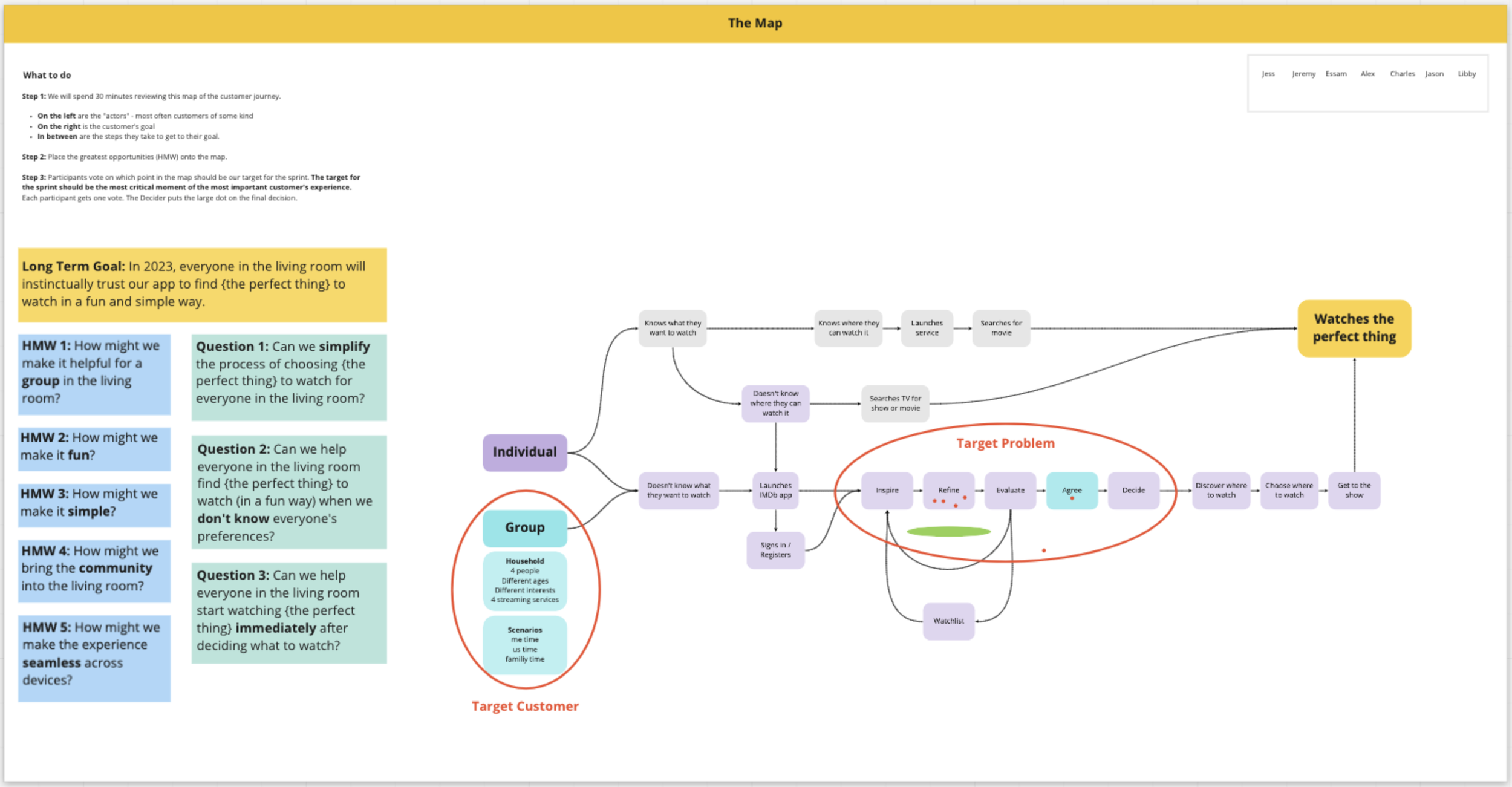
The map of our customer journey, with our goal, opportunities, risks, target customer, and target problem identified.
The Process
Design sprint (May 2021)
The very first week we were an official team, I led an 8-person design sprint: UX designers, engineers, PMs, and stakeholders. We reviewed research, met with experts, identified customer problems, translated them into opportunities, and generated divergent solutions — all remotely.
We identified the fundamental unmet problem: group decision making. Individual recommendation engines exist everywhere. But no product helped a group of people with different tastes reach consensus on what to watch together.


My concept: a gallery of methods — interactive games that used IMDb's data to help groups express preferences, narrow options, and agree. Each game would offer a different approach (genre filtering, binary choices, randomized picks, curated challenges), and the collection would grow over time.

Our lead researcher, Sharon Chou, interviewing one of our study participants.
Research validation (May 2021)
We showed sketches to families in moderated research sessions. Every participant described the concepts as "a fun game." They were relieved by the idea that finding something to watch could be an enjoyable bonding activity rather than a frustrating negotiation. The ideal method changes from scenario to scenario — an app with multiple methods would be most helpful.
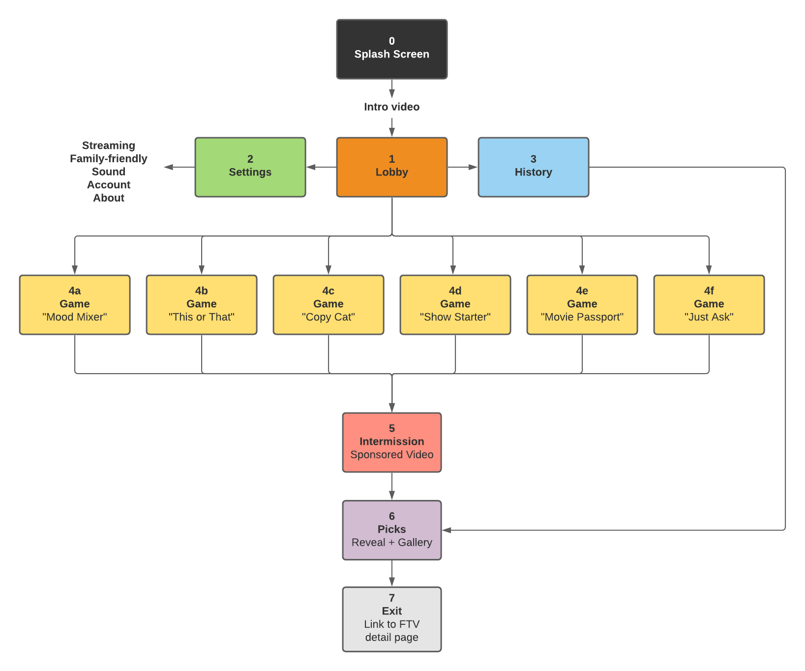
Flowchart created with Lucidchart.

Game logic and templates
I identified three fundamental game templates:
Similarity — recommendations mirror selected titles ("I liked this, show me more")
Filter — recommendations match selected metadata ("Show me 90s comedies under 2 hours")
List — recommendations are editorially curated or personalized
Every game concept mapped to one of these templates. Once a template was built, it could power multiple games with different themes and inputs.
Game brainstorm and testing (July 2021)
I invited the entire company to a brainstorm. Together we generated 60 game ideas. The team voted on 20 to show customers. In a card-sorting study across US, UK, Canada, and India (n=60), participants ranked games by helpfulness across four scenarios: solo, couple, family, and large group.
The most helpful games were described as quick, simple, easy, and fun — with "quick" being the most important attribute.

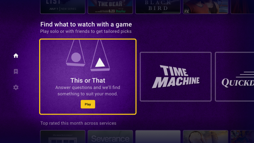
We launched with three games:
This or That — answer preference questions and we narrow your options (Filter template)
Watch Challenge — curated genre lists with stamps and badges (List template)
Quick Draw — shuffle through hundreds of options, pin what catches your eye (Similarity template)
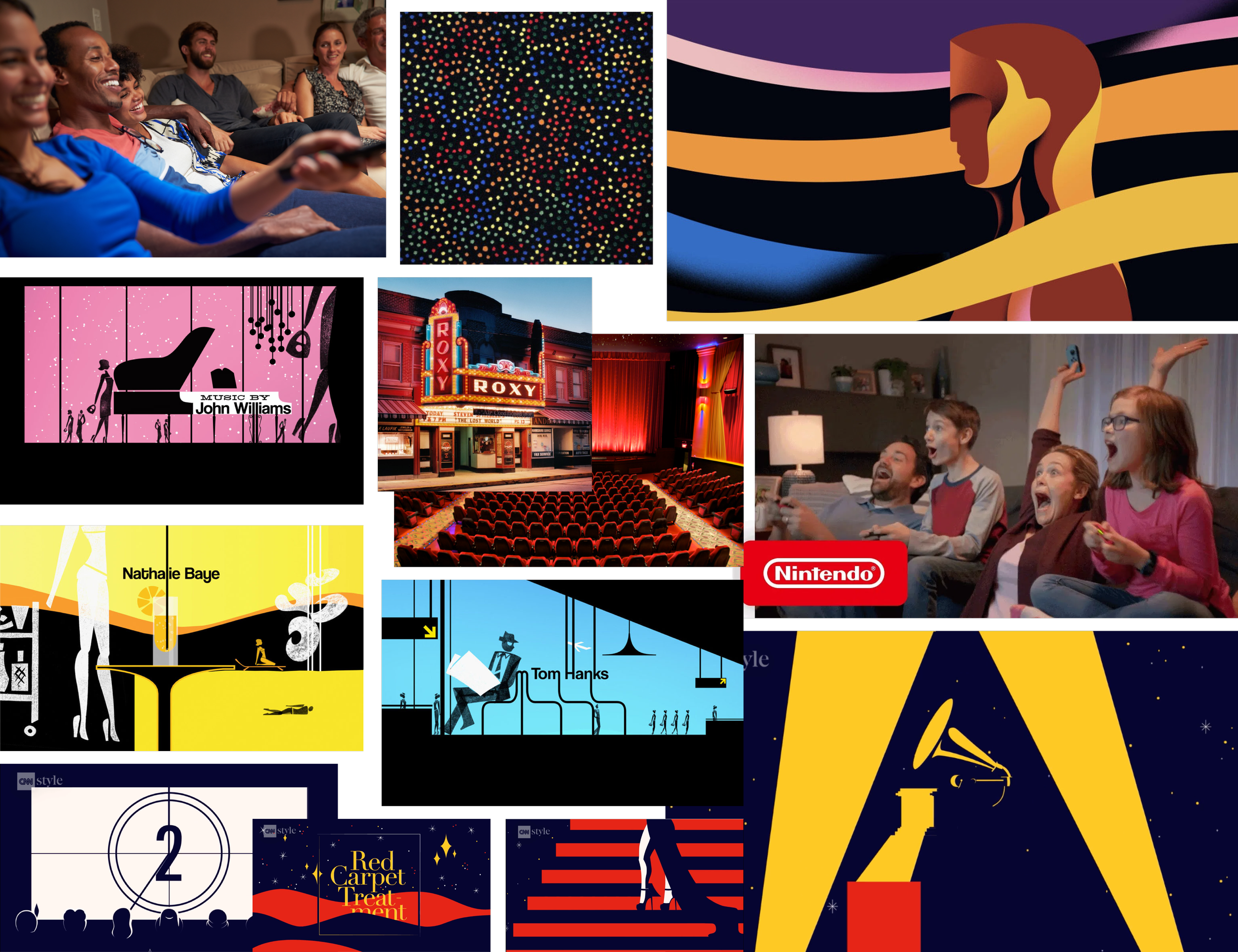
I created a mood board, comprised of families, theaters, and the influence of designer Saul Bass on cinema.
Visual language and branding
I partnered with Marketing and Creative to define the look and feel. My inspiration: the simplicity of pulling a board game off the shelf. Visually, I looked to Saul Bass — his use of metaphor and flat animation in title sequences bridged cinema and playfulness. Something like the opening of Monsters Inc.
Logo, tagline, and splash screen illustration
I co-led a brand design sprint to define our personality: fun, trustworthy, inclusive, efficient. We named the app "IMDb What to Watch" after three rounds of brainstorms, voting, and legal vetting.
Launch animation
The lobby
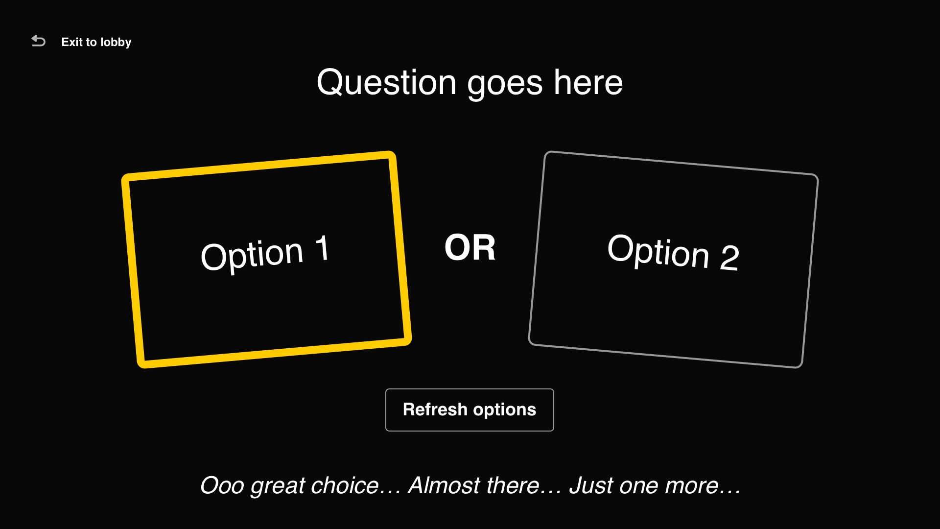
For the in-app experience, I simplified the UI to a single focus state (gold = your current selection) and designed a vertical carousel layout for both the game lobby and results gallery — optimized for readability on TV screens and remote-control navigation.
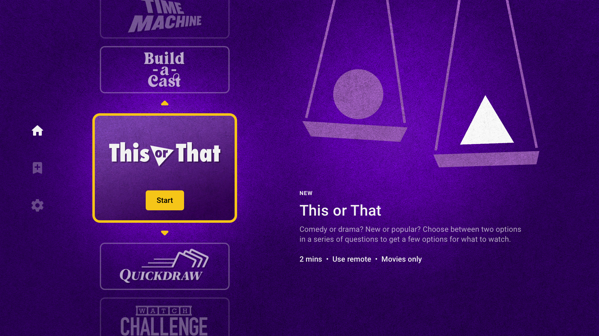
Our first game: “This or That”
The very first game we developed was This or That, which used our filter game template. Our product leader, Jessica Scheibach, came up with the idea for the game in our initial design sprint. The game is simple enough: choose between two options in a series of questions to describe what you’re in the mood to watch. It was popular with customers and was (relatively) simple to build. Or so we thought…
The first problem we discovered was that IMDb was missing a critical piece of information: sub-genres. In order for the recommendations to feel relevant, we needed to provide customers enough granular inputs to describe what they’re in the mood to watch. We would need to partner with IMDb’s Content team to come up with a strategy to properly tag IMDb’s entire catalog.
The second problem was that some choice sequences would result in zero results. Technical limitations prevented us from building a more flexible framework that would simply not show options that would result in zero recommendations. We needed to (1) ensure enough content was tagged and (2) and design the game logic in a way that would reduce the likelihood of a customer receiving zero results.
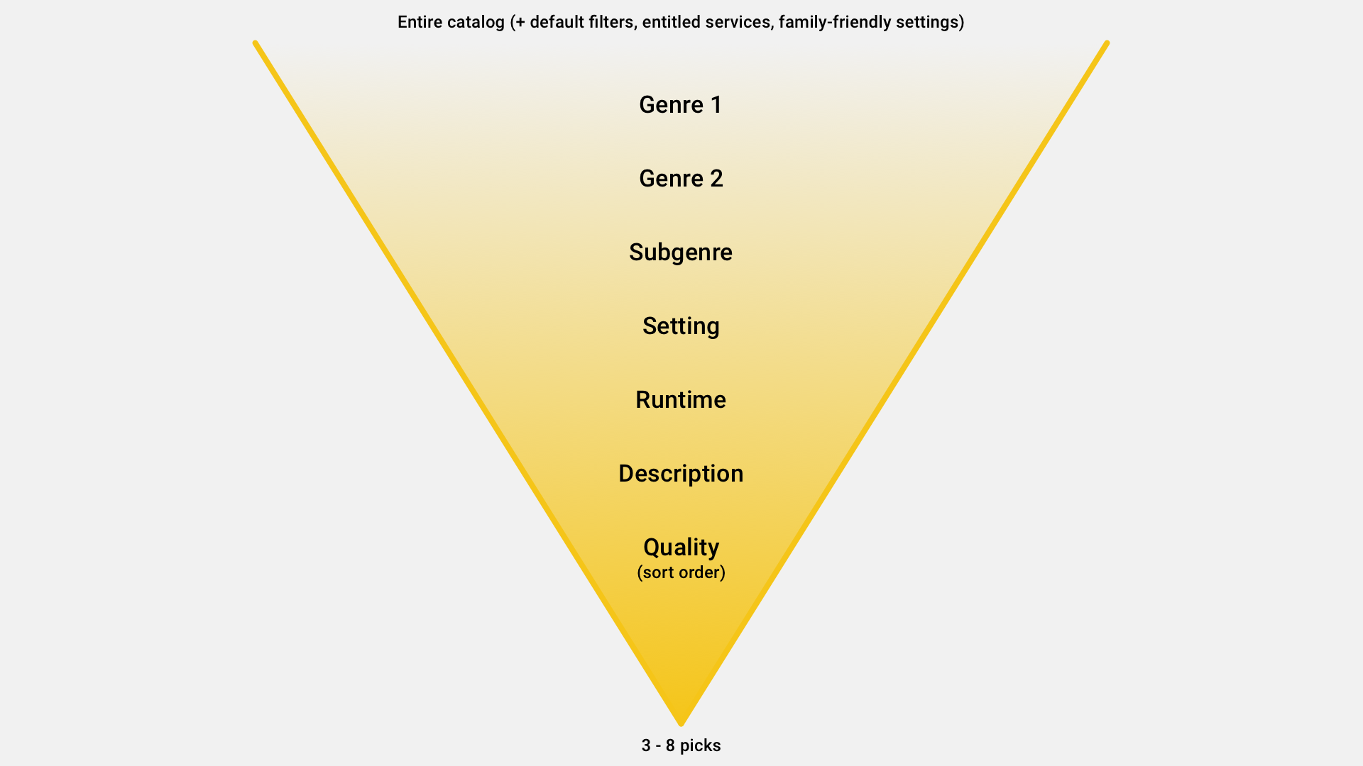
As we manually tagged IMDb’s entire catalog of movies and series with sub-genres, I began to work on the UI for the game. During my design process, I realized that customers would need a record — or a breadcrumb trail — to better visualize how their choices were coming together. I decided to display a sentence at the top that would slowly build as the customer played the game. Building a sentence, however, required some extra work to ensure the structured data appeared grammatically correct — regardless of what options were chosen.


As the UI began to feel more and more like a game show display, like Jeopardy, my UX partner, Kaitlin Powell, suggested that the visuals be brought more inline with Saul Bass: (1) more fun and (2) more metaphorical. She suggested legal scales. She was right.
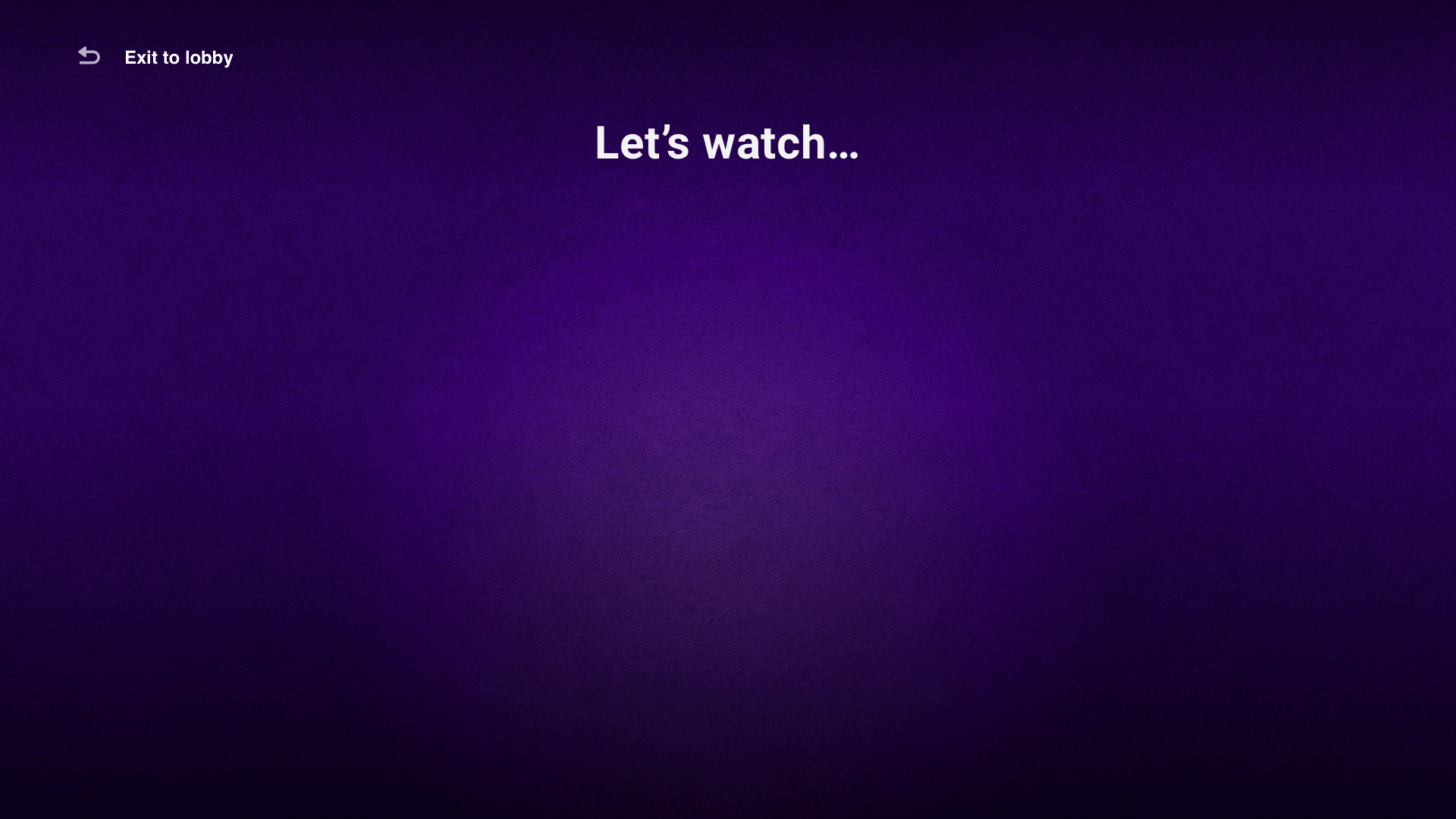
Intermission
Our tenet for advertising stated that ads would not interrupt the critical moments of finding or choosing content. In order to meet our monetization goals without interrupting the customer journey, I invited the intermission. My strategy was to create an opportunity for video ads outside of (1) customers expressing their preferences for what to watch and (2) customers evaluating and choosing what to watch. The intermission would occur after a game, but before the recommendations were revealed.
Intermission animation
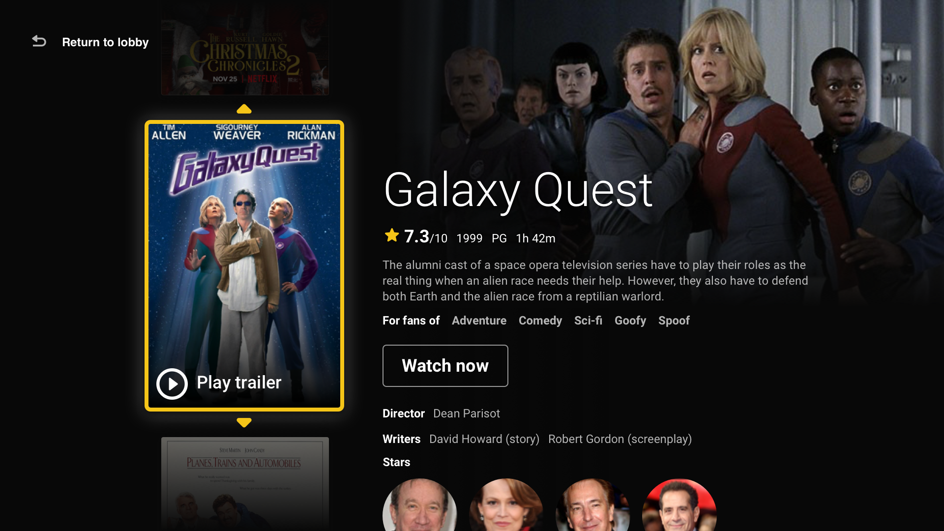
The picks gallery
Without question, the most critical part of the experience was the moment when customers would receive and evaluate their recommendations — the picks gallery. Customers needed to understand how many recommendations they were given, easily navigate between them, and evaluate their options against their situational criteria. Customers told us the most important information when making a watch-decision and we removed everything else.
Initial wireframe
By using progressive disclosure, I was able to use the limited real estate to surface only the most relevant information. I added thumbnails of the posters to provide a birds-eye-view of how many options were available. Inspired by how Spotify recolors the background for each album or playlist to create a more immersive and rich experience, we sourced the primary color from the selected poster for the background.
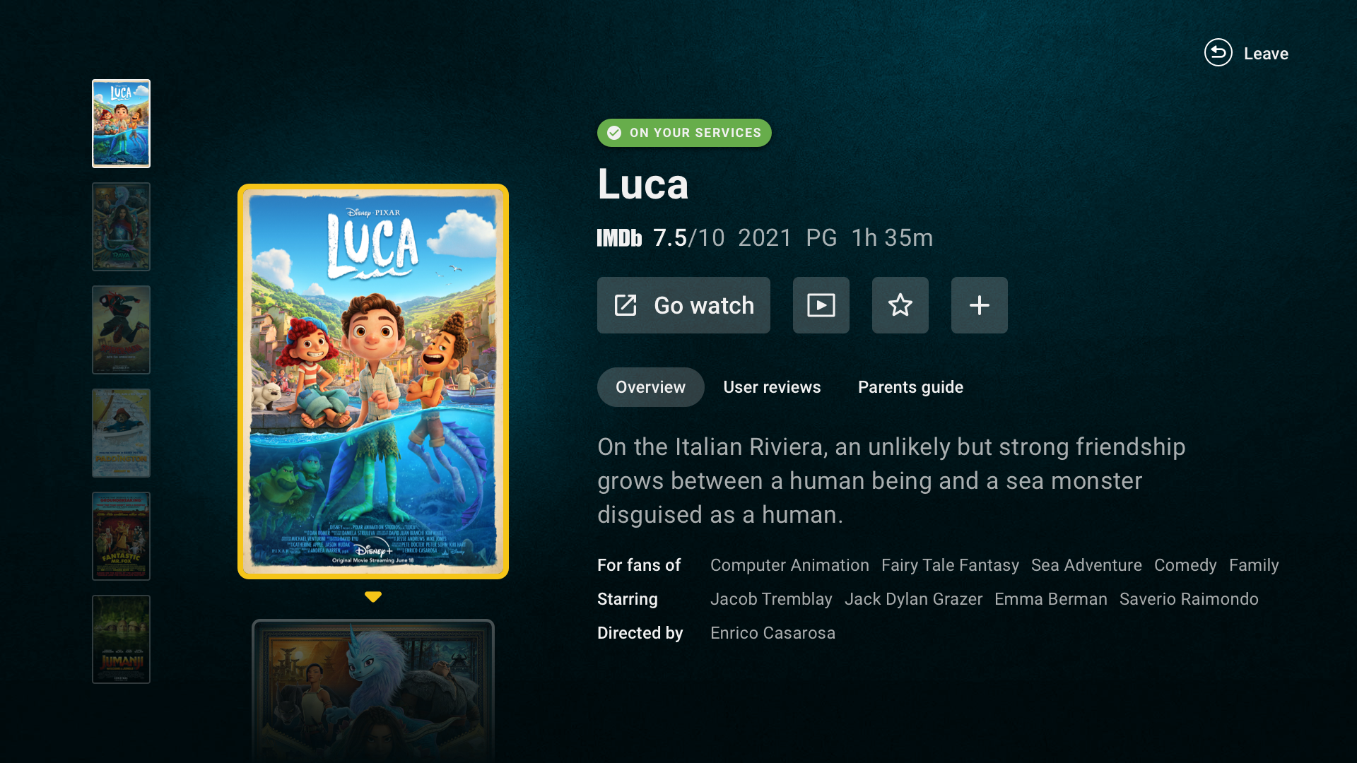
Final design

Exit screen provided options for customers
Et voilà! The end to end experience
Below is a video capture of the actual experience, from the lobby to a set of recommendations.
Launch
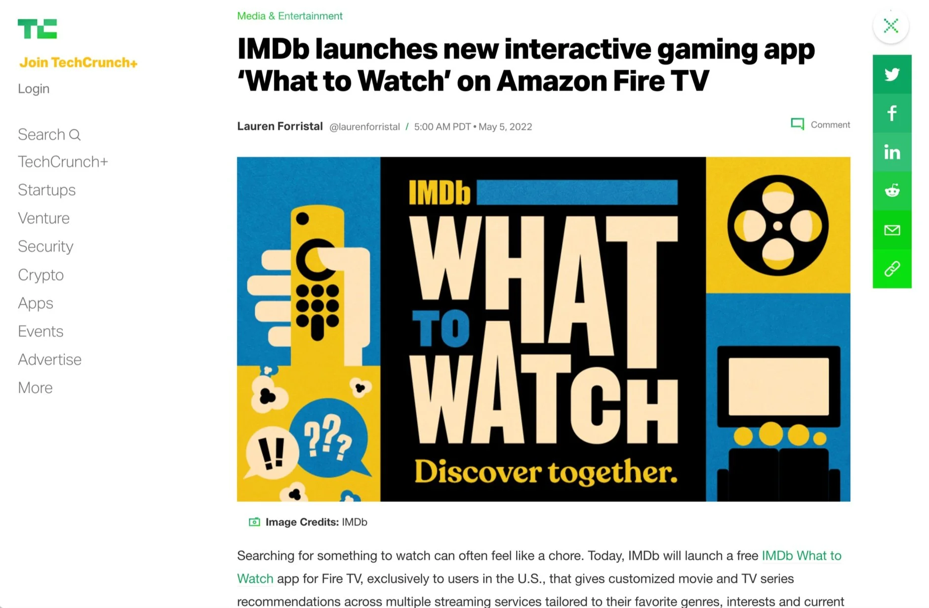
Tech Crunch wrote about our app here
On May 5, 2022, the IMDb What to Watch app launched exclusively on Amazon Fire TV in the US. TechCrunch ran our exclusive. Five articles published on launch day.
Nikki (our CEO) wrote to the company: "By injecting fun into what can sometimes be a frustrating task, the IMDb What to Watch app makes it possible for entertainment fans to say goodbye to endlessly scrolling... I hope you take a few moments today to celebrate!"
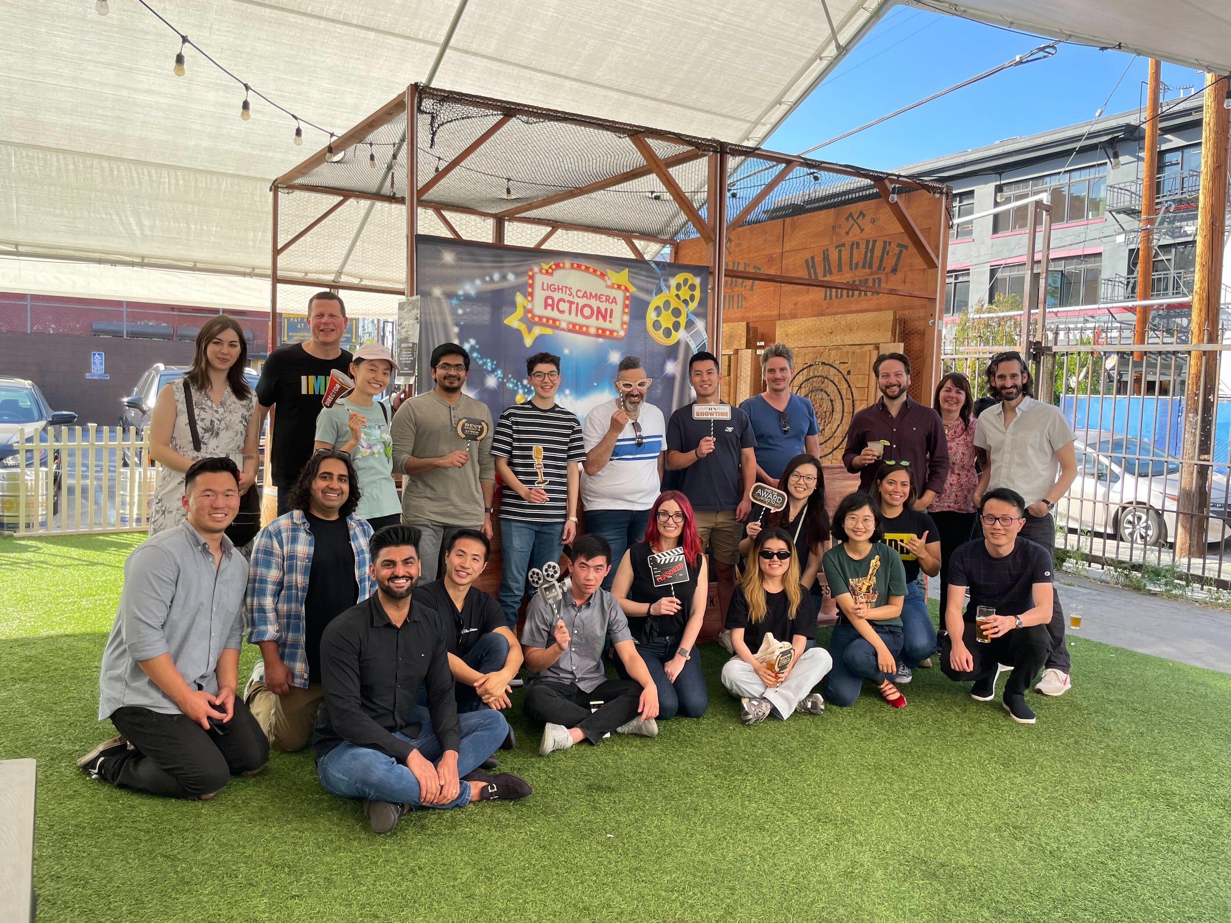
Members of our team celebrating our launch in LA.
We had our moment. The app was live. Families were playing games together and finding things to watch. The vision was real.
Onboarding video
What We Learned
Post-launch research (May 2022)
Within the first week, we ran moderated interviews with seven households. Key findings:
What worked:
Customers were delighted by the animation and quickly understood the concept
"This or That" was the fan favorite — the sequence of choices matched how people naturally narrow options
Subscription service filtering was a "huge value add"
The Watch Challenge lists were engaging even without the gamification ("Better than what Netflix has")
What didn't:
Customers were hesitant about the time investment before trying games
The value proposition wasn't clear enough from the lobby alone
"Quick Draw" needed more control over categories
Badge/trophy motivation was low — "I'm here to watch things, not collect stamps"
Customers expected their streaming services to be prompted upfront, not buried in settings
Metrics (Year 1)
After one year:
83.6K app downloads
337.8K total users
549K visits
56.4K trailers watched
252K "go watch" clicks
These numbers were modest. On a platform with millions of Fire TV devices, adoption was slow. The app required discovery in the Fire TV app store, download, registration — each step losing people. The structural challenge was real: we were asking people to find, install, and learn a new app before they could solve a problem they were actively having in the moment.

New lobby design
The Pivot
Leadership grew impatient with adoption. The response was to make the app more "conventional" — more immediately recognizable as a content discovery tool rather than a game-based experience.
The original homescreen — a lobby of games — was replaced with rows of title recommendations. Games were mixed into the rows rather than being the primary experience. The app shifted from "lean in" (interactive, participatory) to "lean back" (passive, browseable). The theory: lower the barrier to engagement by meeting customers where they already were (scrolling through rows), with opportunities to "lean in" when they wanted more.
Row of games between recommendation rows
The research had told us something different. Customers who tried the games loved them. The problem wasn't the games — it was getting people to try them. Discoverability on Fire TV was brutal. The app was buried in an app store that nobody browsed. Without pre-installation, prominent placement, or expansion to other platforms (phones, Roku, Apple TV), we were fighting an adoption battle that design alone couldn't win.
What the app needed wasn't a pivot to rows. It needed patience and platform expansion. It needed to be everywhere — on your phone, your TV, your tablet — so that when Friday night arrived and the pizza was getting cold, the app was already there. The experience needed to be complete and available everywhere for it to be useful.
But that investment case was never made. Instead, the app became something it was never meant to be: another TV app with rows of recommendations. And there are already hundreds of those.
The Sunset
On July 1, 2024, the IMDb What to Watch app was removed from Fire TV.
Gabriela Ahern, my colleague, wrote: "This is a sweet, sad moment. The work you did on this project was phenomenal. You both role-modeled design leadership and made it what it is."
I replied: "It was the most fun, rewarding endeavor of my career thus far. A huge swing that I will forever be proud of and bask in the warm memory of. I still believe in the idea of the app, full-stop. I smile thinking of the customers who did find our app, discovered something to watch, and more importantly connected with friends and family crammed on the couch with them."
What Lives On
The app is gone. But two of its most important innovations survived and thrived:
Interests — born during What to Watch development as a way to tag titles with specific subgenres for game logic. We needed more granular content attributes than IMDb's broad genres to power meaningful recommendations. This taxonomy became IMDb Interests — which launched on mobile apps in November 2023, expanded to web in 2024, and today reaches 14.4% of IMDb's monthly active users with 280+ interests across genres, languages, and franchises. It's now the foundation of IMDb's personalization engine.
Preferred Services — the "which streaming services do you have?" feature was invented for What to Watch because games needed to know what content was actually available to the household. We brought it to the mobile apps in July 2023, where it now has 6.4MM active users (32.7% of MAU) and powers personalized "where to watch" experiences across IMDb.
Both features were conceived to serve the living room problem. Both found a much larger audience on the platforms where customers already were. The irony isn't lost on me.
Reflection
I still believe in the idea. The problem — group decision-making in the living room — remains unsolved. No product has cracked it. Streaming services continue to optimize for individuals scrolling alone, not families negotiating together. The games worked. The concept worked. What didn't work was the distribution.
We were reinventing the movie-selecting experience for the era of streaming. Like movie theaters once did, like Blockbuster used to — we were creating a ritual around the act of choosing. Browsing the aisles together. Picking up a box and reading the back. Putting it back. Picking up another. The experience of choosing is the experience. We just needed more time and more surface area to prove it.
The lesson isn't "games don't work for content discovery." The lesson is: a product needs to be complete and available everywhere for it to be helpful. An app locked to one platform, buried in an app store, requiring discovery and download before it can solve a problem people are having right now — that's not a fair test of the idea. It's a test of distribution.
The deeper lesson, the one I carry with me: believe in the vision long enough for it to work. Not every great idea gets the runway it needs. That doesn't make it wrong. It makes it early.
My Role
Led the design sprint that defined the problem and generated the solution
Designed the game framework (lobby, game templates, results gallery, end-to-end flow)
Designed the visual language (focus states, typography, color system, layout)
Co-led branding (creative direction for animations, music, SFX, marketing assets)
Led game brainstorm (60 ideas generated company-wide, narrowed to 20, tested with customers)
Partnered with research at every stage (5+ studies from problem definition through post-launch)
Created the content attribute system (subgenres, moods, plot timeframes) that became Interests
Collaborated with 40+ team members across UX, Engineering, Product, Marketing, Editorial, Fire TV, Alexa, Monetization, Legal, and Accessibility
Designed for accessibility (VoiceView support from launch)