
“I think the overall menu and navigation bar at the bottom is more simple than how it was before in the app. People will just need to adjust to the new design.”
— Entertainment Fan,
App Loyalist, Female, Age 32
Summary
Role
UX lead, information architecture, cross-platform unification
Timeline
2019 (design + launch) → present
Team
No PM partner. I owned strategy, IA definition, and stakeholder alignment end-to-end. Collaborated with iOS, Android, and web engineering; editorial; and business stakeholders across the org.
Platforms
iOS, Android, responsive web
Outcome
Single unified navigation serving 250MM+ monthly users for 7 years. Framework survived 5+ major feature additions (Interests, notifications, personalization, community, GenAI) without structural changes.
IMDb Navigation
Overview
IMDb existed as four separate products pretending to be one. Four platforms, four navigation systems, four information architectures. A customer could use the iOS app and the desktop website and have no idea they were the same product. I was asked to unify them, not by copying one to the others, but by making a single, defensible bet on what IMDb's primary destinations should be.
The Problem
Each of IMDb's platforms (iOS, Android, desktop web, and mobile web) had independently evolved its own navigation and information architecture over a decade. The result:
For customers: Inconsistent mental models. Features available on one platform were hidden or absent on another. Browsing felt different everywhere.
For engineering: Every team maintained its own IA. Adding a new feature meant implementing navigation changes in four separate systems.
For the business: Analytics were fragmented. Clickstream data across platforms couldn't be compared because the same destination lived in different places with different labels.
The trigger: IMDb was modernizing the website as a single responsive experience. The new homepage couldn't ship without a navigation that actually unified the product. This wasn't a redesign. It was a decision about what IMDb is at a structural level.
What existed
iOS app: a tab bar with custom destinations and a hamburger menu with a deep, but disorganized, sitemap.

Desktop web: a global nav with mega-menus, a sidebar, and dozens of exposed links competing for attention.
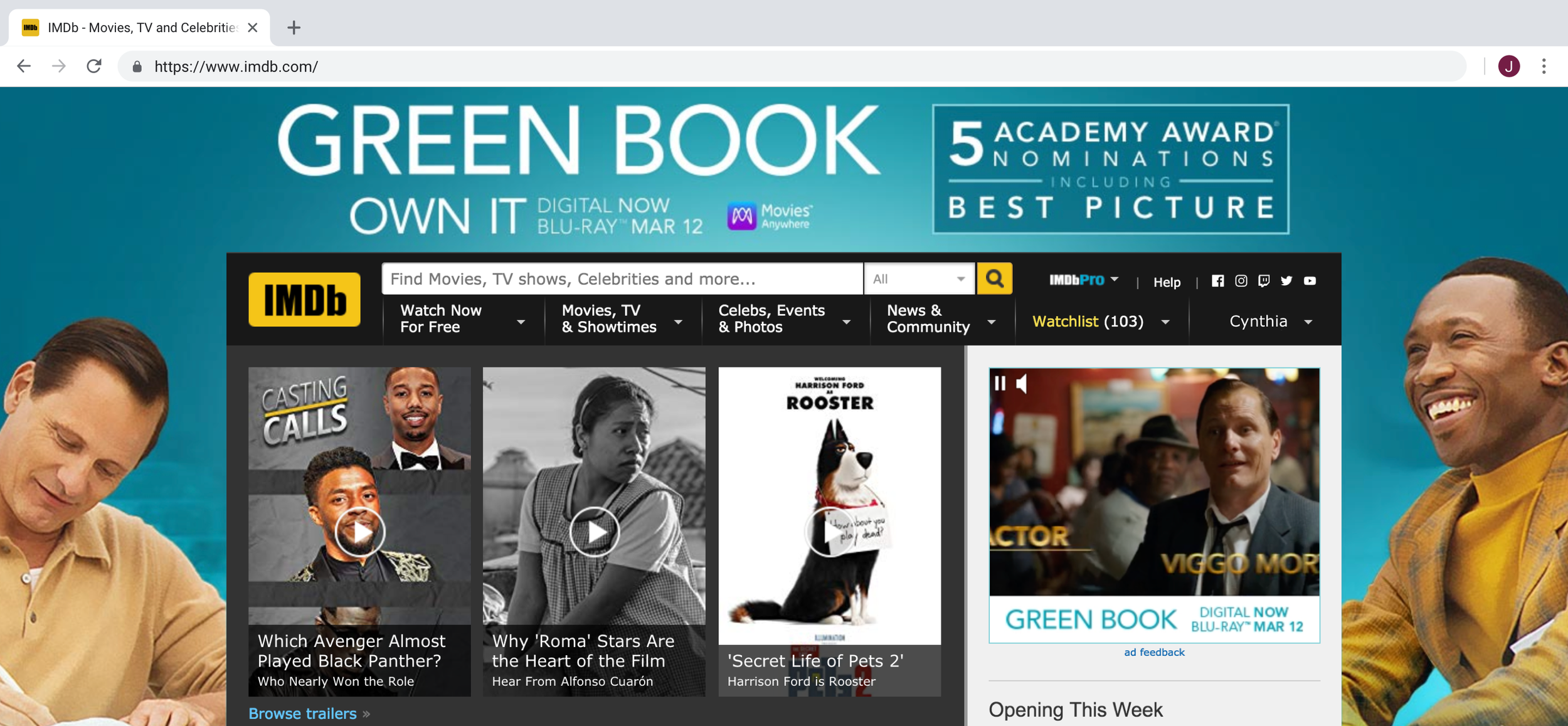
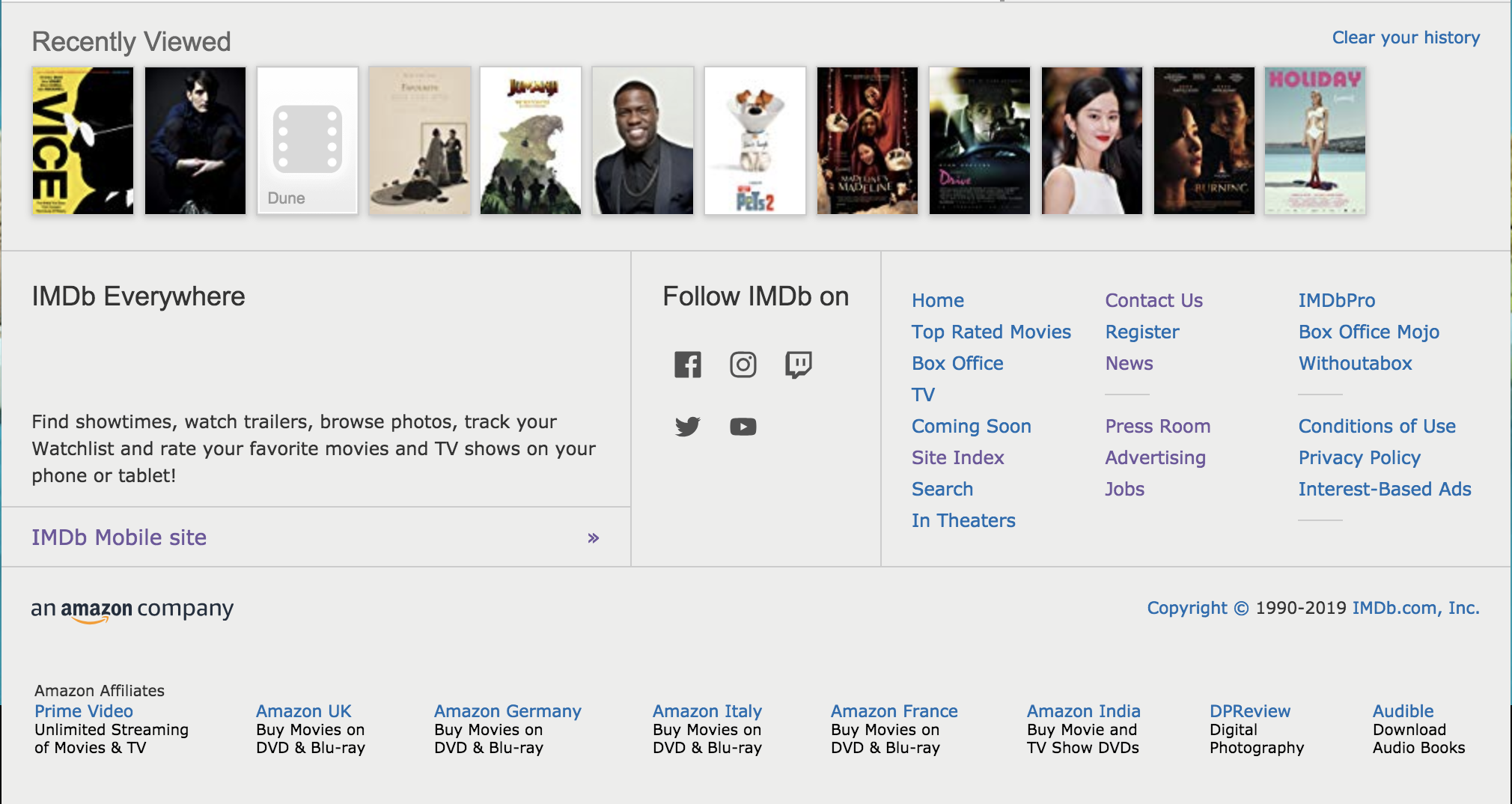
The Hard Part: Simplification
This project came to me without a product partner. The IA needed to be defined, negotiated, and defended across a dozen stakeholders, but there was no PM to write the strategy doc, prioritize the tradeoffs, or align the org. I did that work myself, in addition to the design.
Unification sounds clean in a brief. In practice, it means killing things. Every destination in the existing navigation had a stakeholder who believed it was critical. My job was to separate "critical to customers" from "inherited but unused."
Data-informed reduction
I pulled clickstream data across all four platforms to understand what customers actually used versus what was merely offered:
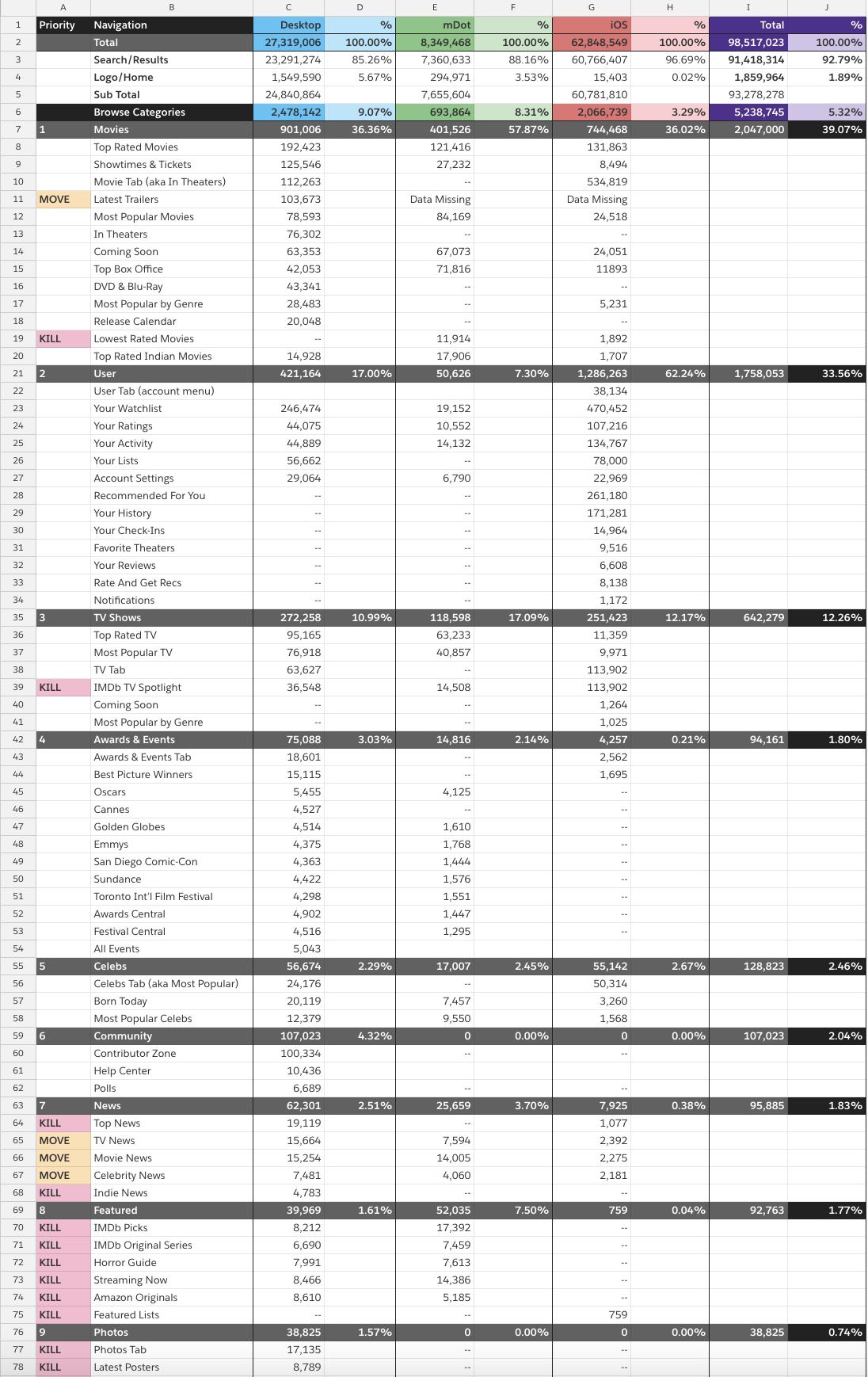
The data revealed a clear hierarchy of intent. Customers came to IMDb to do a small number of things: find something to watch, search for something specific, browse what's available, and manage their lists. The navigation should reflect that behavior, not the org chart.
Stakeholder alignment
I met with teams across the organization (editorial, engineering, marketing, and business stakeholders) to identify:
What was critical to the business (revenue-generating, contractual)
What was critical to customers (high usage, high satisfaction)
What could be deprecated or relocated (low usage, legacy holdovers)
This process was the real design work. The mocks came after. The decisions came first.
The Solution: Five Destinations
I proposed reducing all of IMDb's content to five primary destinations — a framework simple enough for a bottom nav, rich enough for a decade of growth:
Home: Discover the perfect thing to watch, every day
IMDb TV: Watch something right now, for free (rebranded as Freevee, later deprecated)
Search: The fastest path to the specific thing you're looking for
Browse: Explore the breadth of what's available
Profile: Manage your lists, contributions, and preferences
These five destinations mapped to 4 tap targets on mobile (Search and Browse combined) and 5 on desktop.

Mobile apps

Design principles
Focus: simplified bottom nav makes the purpose and value of each destination clear at a glance
Ergonomic: navigation within thumb reach. Resulted in more frequent navigation and context switching.
Relational: the four tap targets communicate shared importance between finding something (Home), watching something (TV), getting answers (Search/Browse), and managing your identity (Profile)
The riskiest call: combining Search and Browse
This was the most debated decision. Search and Browse had always been separate physical spaces. On different tabs, with different UIs, accessed differently. I argued they were the same intent at different confidence levels:
Searching: you know what you want to find
Browsing: your expectations are broader, but you're still looking for something
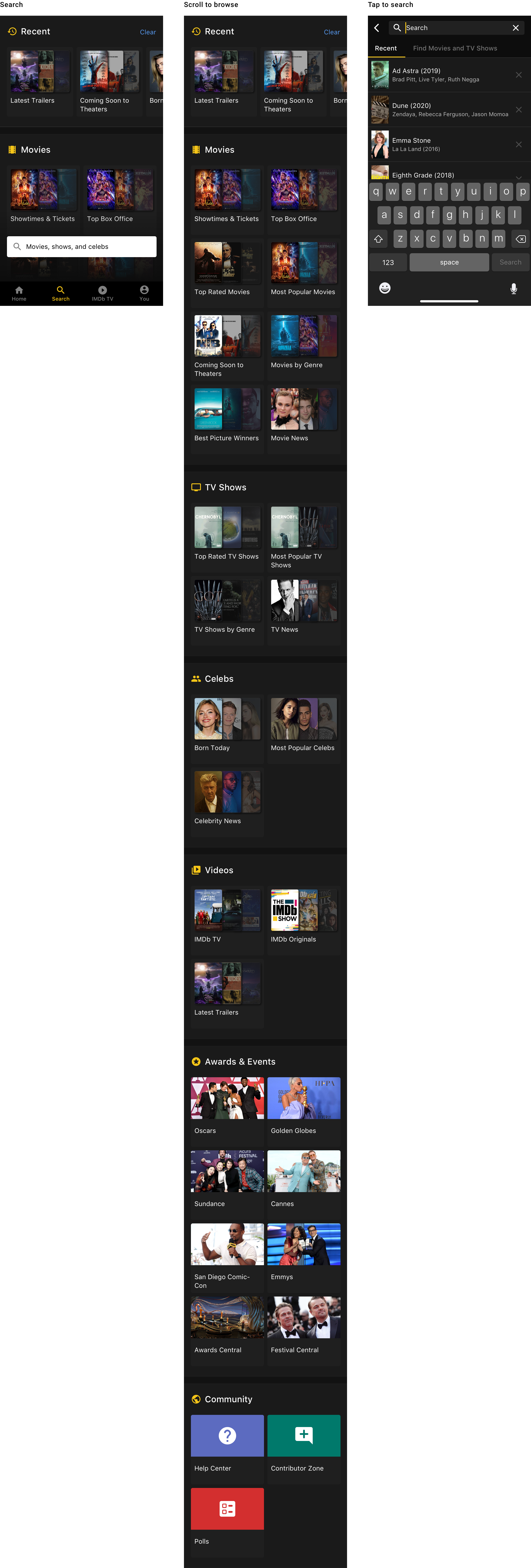
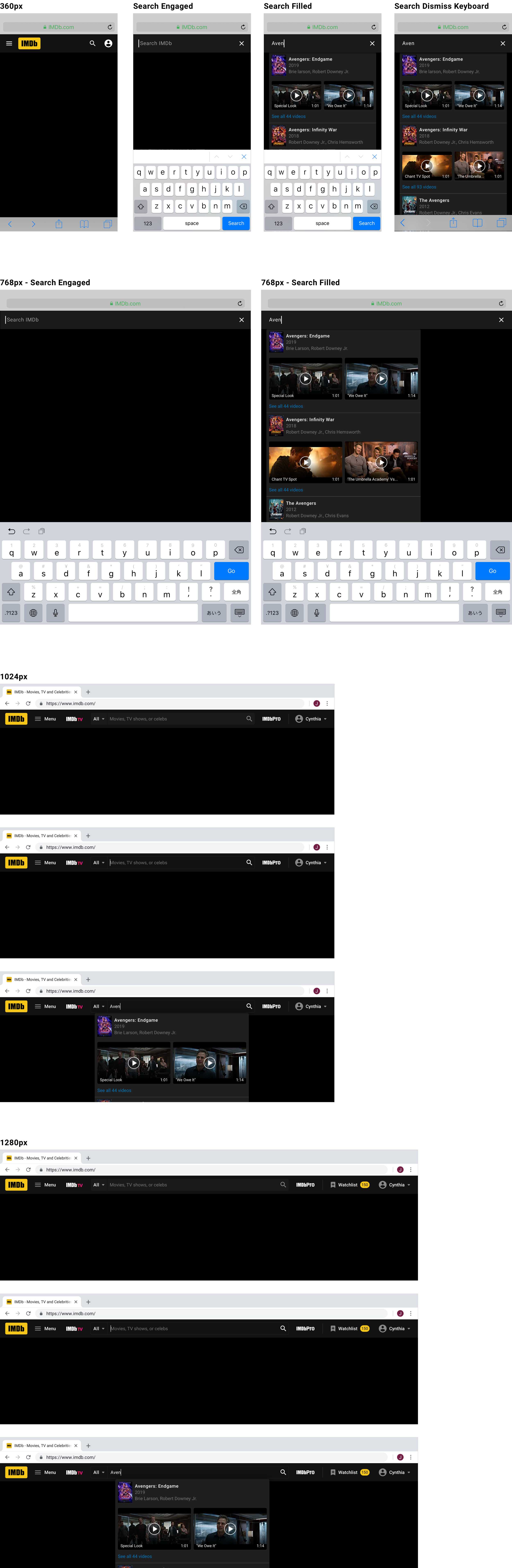
By placing browse categories within the empty state of the search experience, the customer chooses how they want to find what they're looking for. Tap the field to search. Scroll down to browse. One destination, two modes.
The tradeoff I accepted: customers must tap twice to initiate a search (tap search tab, then tap search bar). I judged this acceptable because the browse state provides immediate value. It's not dead space, it's serendipitous discovery.
Responsive web
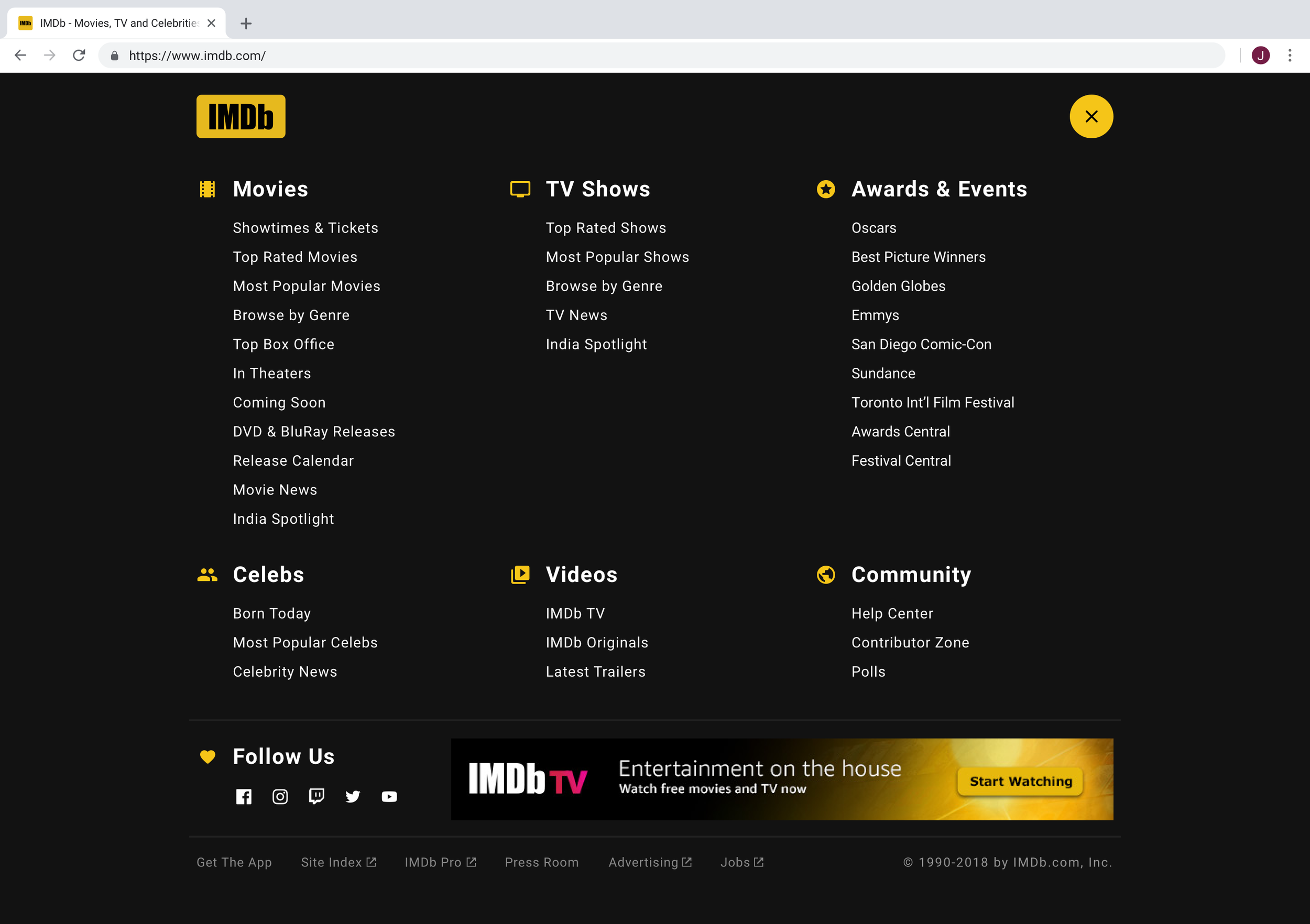
For web, I separated Search and Browse rather than combining them. A different input paradigm, different screen real estate, and different customer expectations. Browse became a drawer on mobile web and a full-screen takeover on desktop.

Navigation menu
Search
Impact
This navigation shipped in 2019 and has remained structurally unchanged for seven years. The five-destination framework held because it was designed around customer intent (find, watch, search, browse, manage) rather than features (which change constantly). When new features arrive, they nest within existing intent categories rather than demanding new top-level real estate.
The quantitative signal: A navigation that survives seven years of product evolution, through streaming wars, AI transformation, community expansion, and three complete homepage redesigns, without needing restructuring is the quietest possible proof that the IA was right.
Reflection
The lesson of this project: the most impactful design decisions are often invisible. Nobody celebrates a navigation that works. Customers don't notice it. Stakeholders forget it exists. But when it's wrong, users can’t find what they’re looking for and guardrail alarms start to ring.
The decision to reduce four platforms to five shared destinations wasn't a UX deliverable. It was an organizational decision about what IMDb is, what it prioritizes, and what it's willing to let go of. The mocks were the easy part. The hard part was the conversations that preceded them, conversations I led without a PM partner to run interference or share the load. What shipped wasn't just a design decision. It was an organizational one, made without the org's usual scaffolding.
Today, I'm evolving this navigation again, designing a contextual Alexa agent bar that collapses the bottom nav as customers scroll, adapting the persistent UI to support AI-forward interactions without sacrificing the clarity of the original structure. The frame bends, but it holds.